
Translated material
What is infographics?

Colta.ru continues the heading "Likbez" , in which experts share with us their views on the fundamental concepts and phenomena of culture. Today, specially for colta.ru Ilya Ruderman, art director of RIA Novosti, a graphic designer and font specialist, tells about the infographics: where its roots stretch, how London was saved with its help and what the infographic boom is associated with now.
The essence of infographics in data visualization. Roughly speaking, this is an image endowed with more meaning than the literal meaning of this image.
By and large, everything is based on the knowledge that mankind collects from the very beginning of its existence.
It is impossible to start a story about infographics without running through the history of art, let's try to do it as clearly as possible ...
An abstract bull drawn by an ancient person outside the context is not yet infographics, but infographics, if a specific instruction is described in the figure: how many people, from which sides to go, how to arm themselves. “Do so, and you will have a bull or deer, you can bring it to your dinner.” All Egyptian art is based on the visualization of the data, and the writing itself is developing precisely because of the same desire (info) to graphically convey meanings-in each icon this or that is formulated (here bright examples will be the icon and ideographic system of writing). Art (art) here is a slightly different story, it connects when the task is functional - to convey the meaning - inferior to the desire to make an impression. Probably, to a lesser extent, they thought about art as such a cave and Egyptian. The main task facing them is the archiving of knowledge and their reporting to subsequent generations. The functionality prevailed.
We can observe the same in the Christian world, for example, in the works of early Christians. They are especially interesting in that there was no skill as such, there were no large number of canons, rules and other frames, but there was a sincere desire to portray, visualize certain knowledge and processes. The most famous tapestry from Bayu (XI century) is a multi -meter story about the Norman conquest of England, made in the form of in modern language, Timline: 70 meters organized in chronological order of illustrations.
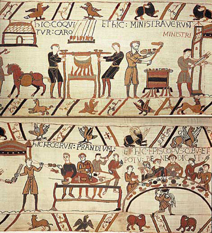 nationlarchives.gov.uk tapest
Each of the emerging sciences in one way or another uses visualization and with its help detects and describes some patterns. All regarding astronomy, chemistry, physics - it all starts with visualizations. Cartography appears, an extremely important component and modern infographics. The development of book art, reduce the cost of replication technology, as well as a request for how to visualize the knowledge accumulated in a particular field come to the rescue of “visualizers”. Here is mathematics and military affairs. All architecture is built on schematic images of objects. This largely infographic type of art contains in an illustrative form the scale, size, helps to visualize and see weaknesses. This is one of the important functions of visualization - ideas that came to you in the form of images, you transfer through sketches or architectural plans for paper. So you see that and where it needs to be undertaken so that it survives for centuries, you thereby find weak places.
In the history of infographics there are several widely known works dated to the 19th century. They in many ways affected the appearance and development of the media infographic genre. One of them was created in 1854 by John Snow. He applied the foci of the disease on London with a cholera, indicated the statistics of deaths in different houses, marked city sources of water. Thus, the well that was the source of the infection was revealed. So Snow saved most of London from the hellish epidemic.
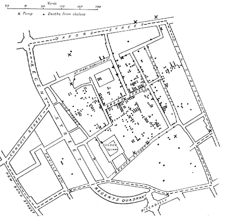 Commons.wikimedia.org John Snow. Cholera distribution on London
The next important and extremely well -known work was created only twelve years later by the Frenchman Joseph Minar. He drew a map of movement and the return of Napoleon’s troops from the campaign . Here, a line is applied to the real geographical skeleton (on the left-Paris, on the right-Moscow), equal to the number of troops, from which some pieces of armies are borne, then merge with it again, and so the growing stream passes through all the battlefields known to us, crawls to Moscow and then, Black, instead of a positive pinkish color, becomes back to Paris. This is a very bright job, because there are several intersecting layers of information. On the one hand, this is a map of the movement of troops. You see how they are physically moving, in every millimeter - thousands of soldiers took one step to the right - to Moscow. You see what battles reduce their number and how much. The line breaks, and you feel what decision was made. You see how they come back, empathize and understand everything about this war. This is perfectly describing the whole war of graphics. One graphic statement that a million stories actually tell you at the same time. Such an important aspect of infographics as a comparison also appears here. Infographics is meaningful only when you have something to compare. For example, you compare the figures of the current and last year. The dynamics appears, and from the dynamics you can build a prognosis, carry out some kind of analysis of the past. So there is a certain picture, the story is StoryTelling .
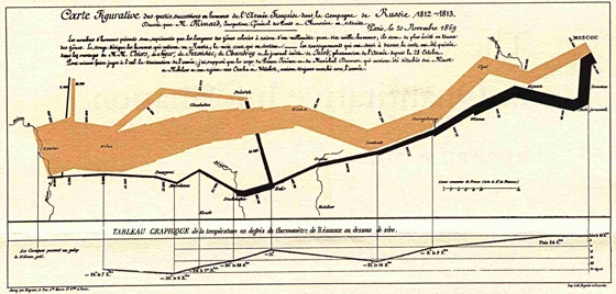 Mattdelhey.com/ Joseph Minar. Napoleon’s troops campaign and return from the campaign
An interesting moment in the development of infographics is when abstract philosophical thought turns the scientific world to theoretical thoughts, when abstract concepts become data and there are things that are physically absent in nature. I bring this to conditional block schemes, when we begin to use things that sometimes have conditional, abstract values as an infographic material, when they do not have numbers, although in fact the essence of infographics is data as such.
Of course, one could make a vivid statement and say that writing in itself is infographics, but this, unfortunately, is not entirely true. To a greater extent, this component is present in notes. The best proof here will be the most famous work of Stephen Malinowski to visualize music. A striking example of his work is the visualization of Beethoven's fifth symphony . This is the case when visualization fills the music with meaning.
In the genre of infographics, several hundred of the brightest breakthroughs of different scale and different levels have been accumulated all the time. Each time, the profession discovers some new angles and unexpected techniques that help visualize data in a new way.
But let's try from the history of art to return to the history of the profession. Before the revolution, in all graphic components, our country developed absolutely naturally, in a single channel with all Western civilizations. We were at the same level of development both in equipping printing houses, and the choice of fonts, techniques and styles, and by the image of thinking, even ahead of somewhat ahead. It was a natural evolutionary process. At this time, our graphic work in any areas did not differ fundamentally from either European or American. However, then the entire ending of the century was marked by the extreme stiffness of the graphics profession, the lack of freedom left only elected, most persistent in the profession. The attitude to the design of tables, graphs and data was then more likely to the technical task, which was sometimes entrusted to people, even far from art: well, a footnote, well, a tablet. We practically do not know the names of the authors of these works, while in the West such designers became famous - Western media holdings and publishers paid great attention to the design and therefore boast of a large collection of chic infographic work from different eras. True, there is an exception here: Soviet cartography from a design point of view was fundamentally not inferior to the world of that period - largely due to the political and strategic significance of science, but nevertheless they cared about the profession and protected.
For our graphic design, it was not so important to fall the borders in the 90s, as the appearance of a computer and the Internet, which in itself is a huge collection of knowledge. The first to pay attention to rival commercial publishers who wanted to make their publications special, different from others-all famous publishing houses since the beginning of the 90s paid increased attention to their appearance, which, of course, had a beneficial effect on the design of periodicals. However, attention to infographics was not formed immediately - for many years, by inertia, it was neglected. I am not ready to say that the whole future is for infographics, but she, of course, has this future. What it will turn into 15 years into is now difficult to predict. The amount of data that surrounds us is that we and our gadgets generate and collect - this knowledge is already many times higher than that humanity is ready to analyze. And the explosion of the popularity of infographics as such is partly connected with the fact that we are already analyzing not only our personal activity-your-mine-but also the activity of society, millions of people, humanity, stars and galaxies. Social networks, cards, open APIs that allow you to control content, GPS navigators and much more -all this greatly affects our daily actions: you look at Yandex -tests (by the way, what is not the infographics?) And you decide, choose such a road or another. We do not even notice how the visualization of certain knowledge surrounds us more and more.
The speed of the appearance and update of graphics is growing. Infographics have been working on news for a long time, especially on such a genre as Breaking News . In RIA, we work out such events in two ways. The first-during the next thirty minutes, one static work should appear, in which the most accurate card of the incident is necessarily present, all the official data from the press services indicating what happened, where, at what time and under what circumstances, how many people the incident affected, contact phones, etc. This thing should come out extremely quickly. Then we produce what is called reconstruction. For its manufacture, we are given only 8 hours, while the global standard is 24. During this time, new data appear, the first hypotheses, etc. On their basis, the first visualization is created. After 8 hours, it is published to clearly show people what happened. Then, over the next day, we make adjustments as information enters - often the graphics in this process change dramatically. This is the most news graphics - there is now more news. In this sense, the task of infographics is the most deployed and in different ways to inform people. We do not draw conclusions, we do not build hypotheses, do not consider options - we do not have competencies and time for this. We visualize facts and official data.
Until recently, infographics in our country were not actually taught anywhere. One of the main reasons for this is that infographics was considered only a type of graphic design. Since you are engaged in graphic design, it is assumed that you should be able to cope with the tasks in the field of infographics, because you have all the knowledge, all experience in order to do this, you know all the programs, the basics of typography and color perception, etc. Optionally, infographics are taught a lot where. I think that Stroganovka, and the Polygraph, and the British at her graphic faculties, this genre, like branding, like packaging and other genre specializations, contain. But it is extremely difficult to go specifically and learn infographics - I still know only one place. Actually, we launched a couple of years ago together with the British Higher School of Design Summer and winter infographic intensivals. Sometimes people come there who are not designers, but are able to talentedly solve the training task, without even having knowledge in certain programs. Despite the fact that none of the employees of the RIA infographic studio received a specialized education in this area, we have gathered the most beautiful team of people who were in the time carried away by infographics and who have their buzz in work in this narrow area. Employers who would write: “We are looking for a designer of infographics for a long time, with prospects,” - there are such units, if they are generally besides RIA. This is a very specific market. For a long time it was perceived as the most boring work. Who consciously 10 years ago was ready to make graphs in annual reports? However, modern design has already developed so much that a hobby and understanding came to the place of boredom that infographics are actually a very interesting thing. This can really be done with burning eyes and with great excitement.
Summing up our little conversation: infographics are an extremely interesting type of graphic design, not yet obligatory, but I am sure, very promising. If you imagine the future designer who is talentedly programming, playing with huge databases and visualizing them at the speed of Breaking Nuz,-I am sure that in this future we will all be very interested in living ...
Prepared by Julia Ryzhenko