
Translated material
About contemporary art
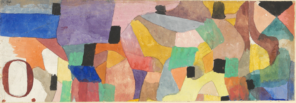
December 15 at the Plane named after A.S. Pushkin opened the exhibition of Paul Klee “not a day without a line” , the first personal retrospective of the famous German-Swiss artist in Russia, who is considered one of the most mysterious and at the same time the most influential masters of historical avant-garde. The creative biography of Paul Klee (1879-1940) is associated with the most important milestones of modernist art - from membership in the Blue Horseman group to participation in the first exhibitions of the Dadaists in Zurich (1917) and the surrealists in Paris (1925), from teaching in Bauhaauz (1921-1933) to presence The "indictment" of the Nazi exposition "degenerative art" (1937).
However, in the consciousness of the public, the original pedagogy and the theory of art of Klee for many years obscured the myth of infantilism and the fantastic nature of his work and the fetching aura of mystery over the artist. So in Russian humanitarian science, the figure of Klee turned out to be closer to musicologists and philosophers than art critics. One of Klee's most famous statements - “art does not depict the visible, but makes visible” - gives an occasion to talk about the artist’s visionary. However, the text published by us opens the ways of a pure method that goes hand in hand with the philosophical perception of the world as forever born, where only random character, fixed in space and time, have only a random.
The text “On Contemporary Art” was first read by Klee as a lecture in Jena Kunstferain in 1924 and published in German and English in 1945 and 1948, respectively (German: Paul Klee : ü Ber Die M Oderne Kunst , Verlag Benteli , Bern - Bumpliz , 1945; English: Paul Klee : On Modern Art , London , 1948). Excerpts from the English translation of Paul Findley entered the anthology of Art in Theory 1900 –1990 : Anthology of Changing Ideas / Ed . by Charles Harrison & Paul Wood ( Blackwell Publishing ; 2 ND Edition , 2002), according to which a real transfer to Russian was made. Prevent and translation from English - Ekaterina Lazarev.
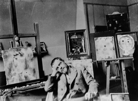 Paul Klee. Self -portrait
Can I use a comparison with a tree for example? The artist studied this world of diversity and, as we can assume, quietly found his way in it. His ability to navigate brought order to a fleeting stream of images and experience.
This is the ability to navigate in nature and life, this set of branching and distribution, I will compare with the root of the tree.
From the root, the juice flows to the artist, flows through it, flows to its eye. Thus, the artist becomes like a tree trunk.
The columnar and excited by the power of this stream, he makes his vision into the work.
So, with a complete idea of the world, like the crown of a tree, it unfolds and spreads in time and in the space of its work.
No one would say that the tree is growing its crown in the image and likeness of its root. There can be no mirror reflection between the top and the bottom. It is obvious that the implementation of various functions in various elements should make significant discrepancies.
But it is the artist from time to time that they refuse the right to deviate from the nature that his art requires. He is even accused of incompetence and intentional distortion.
And yet, taking the place of the tree trunk, he does nothing more than collects and conveys what comes from the depths to him. He does not serve and does not rule - he transfers.
His position is modest. And the beauty of the crown is not his own. He is just a channel.
It is the artist from time to time that they refuse the right to deviate from the nature that his art requires.
***
The creation of a work of art - growing a tree crown - should, as a result of falling into a specific measurement of picturesque art, be accompanied by a distortion of a natural form. For here nature is reborn.
What is this a special dimension in this case?
First of all, there are more or less limited, formal factors, such as line, tone and color.
Of these, the line is the most limited, being exclusively a matter of measure; Its properties are the length (the line is long or short), the angles (stupid or sharp), the length of the radius and the focal distance. All these are quantities exposed to measurement.
The measure is a feature of this element. Where the possibility of measuring is in doubt, the line cannot be considered in absolute purity.
A tone (or, as it is also called, chiaroscuro) - a lot of degrees of shading between black and white has a significantly different nature. This second element can be characterized by weight. One step can be more or less saturated with white energy, the other is more or less loaded with black. Various steps can be weighed by putting on different bowls. Further, black can be balanced in relation to white (on a white background), and white - to black (on a cool board). Either those and others can be compared with the average gray.
The third element is a color that, obviously, has completely different characteristics. For he is not subject to weighing or dimension. Neither with the help of Libra, nor the ruler, the differences between the two surfaces are found, one of which is purely yellow, and the other is purely red, albeit equal to the area and equal brightness. Nevertheless, there is a significant difference, which we denote the words “yellow” and “red”.
Based on my own experience, it depends on the mood of the artist which of the many elements will be taken from the general order, from a certain population, in order to connect together in a new order and create an image that is usually called an object.
In the same way, salt and sugar can be compared - as salty and sweet.
Therefore, the color can be defined as quality.
Thus, we have three formal means at the disposal - measure, weight and quality that are interconnected in a certain way, despite fundamental differences.
The form of these relations will be shown the following short analysis.
Color is, firstly, quality. Secondly, it is also weight, since it has not only a shade, but also brightness. Thirdly, this is a measure, because in addition to the quality and weight, it has borders, area, length that can be measured.
The tone is, first of all, the weight, but its length and boundaries are also a measure.
The line, however, has exclusively a measure.
Thus, we have three quantities that intersect in the area of pure color, two in the field of pure contrast, and only one applies to the area of the clean line.
These three quantities report the character in accordance with the characteristics of each separately, and these are three interconnected departments. The largest contains three quantities, the average - two and the smallest - only one. <...>
This shows an amazing combination of our quantities, and it is quite logical that the highest order should be organized with the clarity of their use. They are able to give rise to a sufficient number of combinations.
Uncertainty in the work is permissible, therefore, only when there is a real inner need in it. A necessity that could explain the use of color or very pale lines or introducing even greater uncertainty thanks to the shades of gray in the transition from yellow to blue, for example.
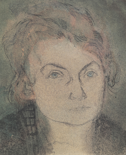 © Center Paul Klee, Bern Paul Klee. Without the name (Lily Kleu-STUMPF). About 1906
***
Leaving this topic of formal elements, I will go to the first design, using the three categories of elements that have just been listed.
This is the climax of our conscious creative effort.
This is the essence of our craft.
This is important.
Thanks to this - the skill of this artistic means - the structure can be ensured by such strong reasons that it will be able to go far beyond the limits of conscious effort.
This phase of design has the same critical importance in a negative sense. This is a point where you can lose the most important and significant aspects of the content and fail, even if it had a fair talent. For you can simply get lost in formally. Based on my own experience, it depends on the mood of the artist which of the many elements will be taken from the general order, from a certain population, in order to connect together in a new order and create an image that is usually called an object.
This choice of formal elements and the form of their interaction in the designated boundaries are similar to the concept of a motive or topic in music.
He tells himself, thinking about life around: this world at other times looked different and in the future he will look different again.
The gradual development of this image before the eyes gives rise to associations of ideas that provoke the interpretation of the material. For any complicated image with some effort of imagination can be likened to familiar pictures of nature.
These associative properties of the structure, once shown and called, are no longer connected exclusively with the will of the artist (at least with his tense desire), and it is these associative properties that are a source of passionate misunderstanding between the artist and the layman.
Whereas the artist still puts his efforts to group the formal elements cleanly and logically so that everyone is in his place and does not encounter others, the layman who looks over his shoulder pronounces the discouraging: “But this does not look a little like an uncle.”
The artist, if he has strong nerves, thinks to himself: “To hell with an uncle! I have to complete my building ... This new brick is heavy and, it seems, slightly outweighs the left part, it is necessary to add a counterweight to the right size to restore the balance. ”
And he adds from this side and from that until finally the balance is established on the scales.
And he calms down only when in the end he overcomes the fluctuation of his unique clean structure from good elements, when it retreats, leaving the opposites presented in the picture as a contrast.
But sooner or later the artist himself, without the participation of the layman, may arise an association of ideas. Then nothing should restrain him in accepting her if she comes on the desired wave.
The recognition of this material association can clearly and significantly supplement the once formulated subject. If the artist was lucky, these natural forms can fit into a small gap in a formal composition, as if they were always present there.
Therefore, the topic is less related to the issue of the existence of an object than with its appearance at some point-with its nature.
I only hope that the layman, always looking for a favorite object in the picture, will, as for me, will gradually die out and will remain only a ghost that is not able to prevent his weakness. <...>
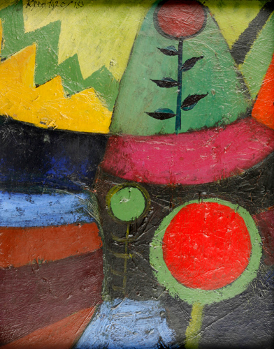 © Center Paul Klee, Bern Paul Klee. Three flowers. 1920
***
Certain proportions of the line, a combination of certain tones and harmony of color at this time bring with them quite characteristic and wonderful ways of expression.
Linear proportions can, for example, be sent to the corners: corner and zigzag move, as opposed to smooth and horizontal, cause expressive resonances, as well as contrasting.
In the same way, the concept of contrast can be given by two forms of a linear structure, one of which is composed of a firmly connected structure, and the other from freely diffused lines.
Contrasting ways of expressing in the area of tone give:
- the widespread use of all tones from black to white, implying the greatest intensity;
- or limited use of the upper light half or the lower dark half of the tone scale;
- either medium shades around gray, which implicitly express weakness due to an abundance or lack of light;
- Or timid shadows in the middle. They again demonstrate a huge semantic contrast.
And what great opportunities for changing the meaning does a combination of colors offer!
Color as a gradation of tone: for example, red in red, that is, the entire range from the deficiency to an excess of red, either extremely wide or limited. Then the same - in yellow (something completely different). The same with the blue - what contrasts!
Or colors, diametrically opposite, that is, changes from red to green, from yellow to purple, from blue to orange.
Huge portions of meaning.
Or color changes in the direction of the chord of the color circle that do not affect the gray center, but found in the area of a warmer or colder gray.
What a subtlety of shades in comparison with the previous contrasts!
Or - color changes around the circumference of the color circle, from yellow through the orange to red or from red through purple to the blue, or a large throw through the entire circle.
What huge variations from the smallest shades to a flaming symphony of color. What are the prospects in the field of meaning!
Or, finally, a trip through the entire area of color, including the gray center and the black and white poles of the tone scale.
You can overcome these recent opportunities only in a new dimension. We have now considered only a suitable place for various colors, since any choice, obviously, has its own capacity capabilities.
And each form, each combination will have its own special constructive expression, each figure - its own face, its own features.
I do not want to represent a person as he is, but only what he could be.
***
Now I would like to investigate the measurements of the object in a new light and thus try to show how it turns out that the artist often comes to what is perceived as an arbitrary “deformation” of natural forms.
First of all, it does not give such a great significance to a natural form as many critics-realists, because for it these final forms are not real material in the process of natural creation. For it attaches more importance to those forces that form the world than the final forms themselves.
He (maybe unintentionally) is a philosopher, and if he, as optimists, does not hold this world for the best of all possible, then he does not consider him too bad to serve as a kind of model, but he says: he says:
"In its real form, this is not the only possible world."
Thus, with his penetrating gaze, he considers the finished forms that nature places in front of him.
The deeper he looks, the more readily he can expand his point of view from the present to the past, where one of the most important image of the creation, genesis, than the image of nature, the final product, produce a deeper impression on it.
Then he admits the idea that the process of creation today can hardly be completed, and he sees an act of world creation, extending from the past to the future. Eternal birth!
He goes even further!
He tells himself, thinking about life around: this world at other times looked different and in the future he will look different again.
Then, flying away into infinity, he thinks: it is very likely that on other stars the creation made a completely different result.
Such mobility of thought in relation to natural creation is a good training of creative work.
It has a force that allows the artist to make a fundamental shift, and if he himself is moving, he can rely on himself, maintaining freedom in the development of his creative methods.
By virtue of this, the artist should be forgiven if he regards the current state of external manifestations in his special world as randomly fixed in time and space. And as the whole inappropriate to his permeating vision and depth of feeling.
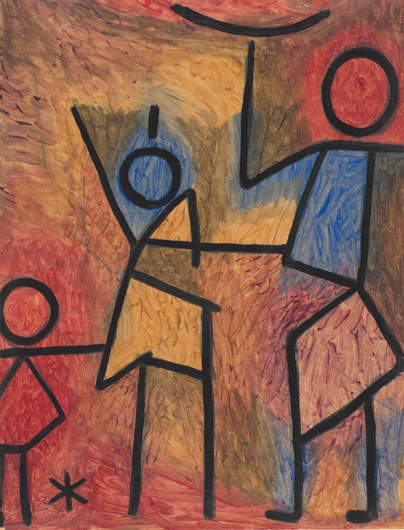 © Center Paul Klee, Bern Paul Klee. Without the name. Around 1940
***
These restless times brought chaos and a mess (or it seems so if we are too close to judge them).
But among artists, even among the youngest of them, one belief, it seems, is gradually affirmed - the desire for the culture of these creative means, for their pure cultivation, for their pure use.
The legend of the childhood of my drawing must have come from those of my line compositions in which I tried to combine a specific image, say, a person with a pure representation of a linear element.
If I wanted to imagine a person “how it is”, then I would have to use such an amazing disorder of the lines that there would be no question of a pure representation of the element. The result would be uncertain beyond recognition.
But one way or another, I do not want to represent a person as he is, but only what he could be.
And only in this way I could achieve a happy combination of my vision of life [ Weltanschauung ] and pure artistic skill.
And so in the entire area of use of formal products - in everything, even in colors, it is necessary to avoid any trace of uncertainty.
Then this is what is called the untruthful of color in contemporary art.
As can be seen from the example with "childhood", I devote myself to working on individual processes in art. I am also a drawer.
I was engaged in a clean pattern and painting of pure tone gradations. In color, I tried all individual methods to which my ability to navigate in the color circle led me. As a result, I developed picturesque methods of color shades, additional colors, polychromatism and total painting.
Always combined with more subconscious measurements of the picture.
Затем я испробовал все возможные синтезы двух методов. Соединяя и снова соединяя, но, конечно, всегда сохраняя культуру чистого элемента.
Иногда я мечтаю о работе действительно огромной широты, проходящей через весь спектр элемента, объекта, значения и стиля.
Боюсь, это останется мечтой, но хорошо уже сейчас иметь в сознании эту потенциальную возможность.
Ничто не может быть сделано рывком. Оно должно вырасти, произрасти изнутри, и если когда-то придет время для такой работы — тем лучше!
Мы должны продолжать поиски!
Мы нашли части, но не целое!
Нам все еще не хватает абсолютной власти, ибо с нами нет людей.
Но мы ищем людей. Мы начали с этого в Баухаузе. Мы начинали тогда с сообщества, которому каждый из нас дал то, что имел.
Большего мы сделать не можем.