
Translated material
"Peter I was an awesome art director"
Designers Ilya Ruderman and Yuri Ostromentsky - about where the fonts came from and how they are arranged
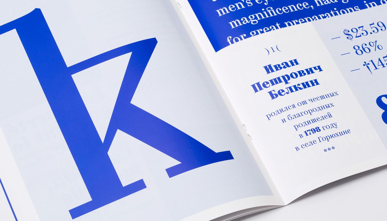
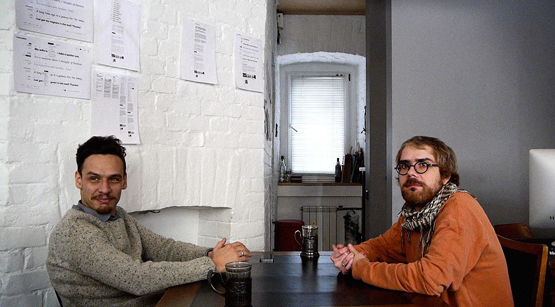
Moscow designers Ilya Ruderman (former art director of RIA Novosti) and Yuri Ostromentsky (former art director of the Big City magazine) launched a Type.TODAay font store on April 21. The publisher of Medusa Ilya Redist talked with them about where the letters that we see everywhere came about the difference between Cyrillic and Latin and the influence on the fonts of Goebbels and Peter I.
- I warn you. I will ask stupid questions.
Ostromentsky: It seems to me that this is the only correct installation.
- Do you have the most hated letters?
Ostrointsky: Yes, of course. I really do not like the penultimate letter of the Georgian alphabet (ჯ ჯ, she’s also Giani - approx. “Medusa” ), which, it seems, according to Georgians, came up with some saint. It is impossible to draw this completely.
- Many designers hate “g” and “d”.
Ostromentsky: No, no, no. We love them.
Ruderman: There are a lot of terrible letters that are drawn for weeks, this is true. There is such a clumsy, similar to a paper clip, in the Abkhaz alphabet - such as a spiral that is twisted into itself ( it looks like this: ҩ - approx. "Medusa" ). But my emotions are more likely: "Wow, Lord, dilated by Cyrillic, it means to draw this Abkhazian thing again."
- What is the difference between the Cyrillic alphabet and Latin? For you.
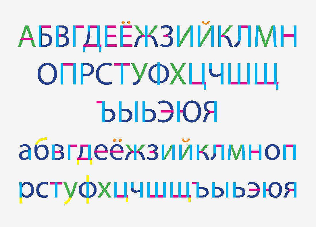
Ruderman: I conducted a very subject analysis of this difference. I came up with a whole technology. I dismantled both Cyrillic and Latin on spare parts. I said that in every sign of the Cyrillic alphabet, in every sign of the Latin alphabet there are things that are identical. Well, for example, there is a vertical wand, there is a round element, there is a diagonal stick, etc. And having sorted it to spare parts, I began to compare two texts in English and in Russian. And he came to the following conclusions: the real difference between Cyrillic and Latin is in the rhythm. The rhythm of Latin is more harmonious, more smeared, more even. In Cyrillic, there are different situations-well, this is how our adjectives ending on some "-nic" or "-not." And as a result, it turns out that in the Russian language the alternation of elements is more irregular, there are no places of vertical sticks at all, there are some triangles with circles, as in the word “milk”. The second conclusion: there is much more in Cyrillic. From a formal point of view, the Cyrillic alphabet is more verbose, more saturated with movements, details in one line.
- Is it good or bad?
Ruderman: It's different. Many call Cyrillic fence. I thus denied this statement - because the fence involves many vertical sticks. This is wrong. They are simply located differently, and from this, such sensations arise periodically.
Ostromentsky: the Cyrillic alphabet has another feature - it was invented in its current form about 300 years ago and it is still young. Therefore, the Cyrillic alphabet has a little more escape capabilities to the right or left. Therefore, the Cyrillic alphabet has a little more opportunities to experiment, and this is good.
- 300 years of Cyrillic?
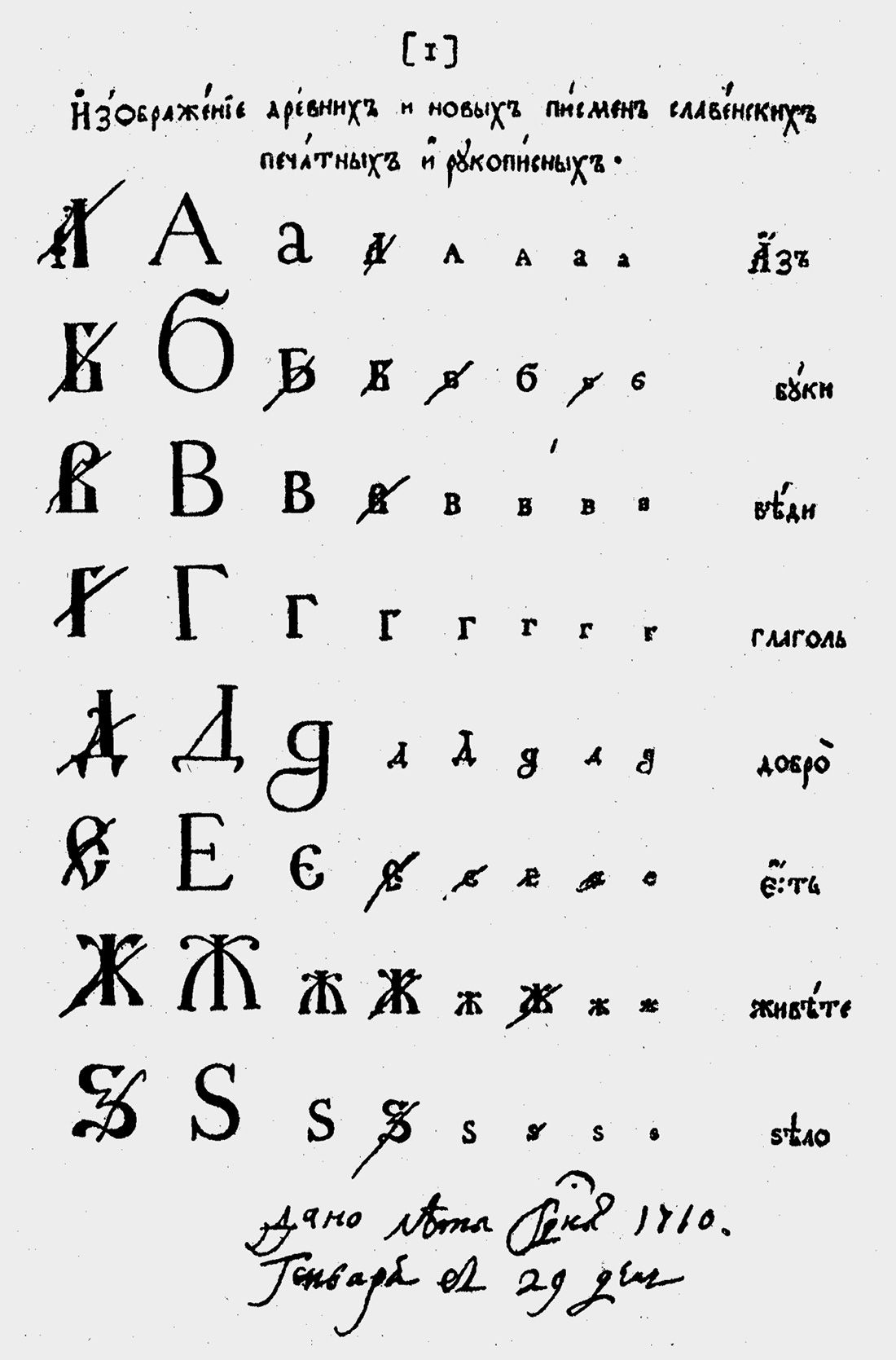
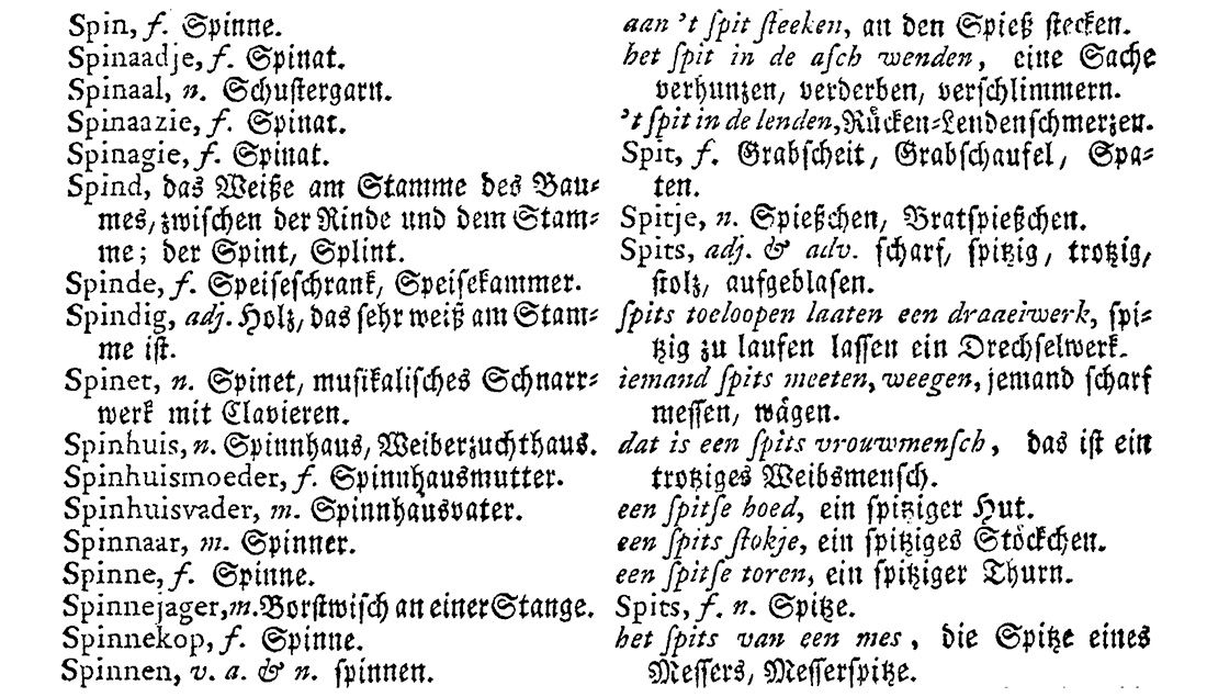
Ostromentsky: Yes. Peter I went to the Dutch and ordered them the alphabet. And before that, everything looked about the same as in a prayer book.
- i.e. Cyrillic was invented by the Dutch?
Ostromentsky: Yes. In 1708. The letter "h" first looked the same as the Latin "s". In the tenth, they did as "h".
Ruderman: This is a well-known one, in fact, the fact, Peter I was an awesome art director. In front of him lay an alphabet with different types of designs of a particular letter. He sat and deleted them. He said: "That's how the letter will look, but it will not be like that." At the same time, he simply raised the whole letters, because he did not like them. Some then, however, returned.
-How do you still feel about Cyrillic? Many designers hate her.
Ostromentsky: A simple answer: We, of course, love her warmly. I am at least.
Ruderman: I have a pragmatic answer-she, in general, feeds us, and thanks to this there is such a unique profession as a Cyrillic font designer. There is also a striking story: on the one hand, we, on the one hand, are talking about the Cyrillic alphabet as a space for a greater experiment and a less cultivated field, but, on the other hand, we are zealous conservatives that protect Cyrillic alphabet from any Western invasions and any Western attempts to shake it, precisely because we consider it a very special system of writing that arose largely contrary to, and not thanks to. They bore and broke, and as many reforms as Cyrillic survived, probably not a single system of writing. Okay, Peter's reforms, but in the 1930s, most of the Cyrillic wealth was simply destroyed, put on bullets.
- In what sense?
Ostromentsky: Everything is very simple. By 1917, a huge number of fonts were poured in Russia. After the 17th year, the Communists decided that all this should be urgently controlled and there should be about 30 fonts. There were about as much until 1991. And the rest of the sets melted.
- In the bullets?
Ostrointsky: Yes, yes. On swords and screaming.
- Are there successful and unsuccessful writing? Still, writing is a system. The system can be successful and not very.
Ruderman: What criteria to measure? By the number of users? Then Chinese users will find themselves in a large win, because their superior system with a thousand hieroglyphs leads by the number of users. There were people who tried to come up with new alphabets. There were several attempts, and they are really unsuccessful, simply because they did not enjoy popularity, no one switched to them. There was an attempt by Germany to get rid of the ß sign-it failed ( the reform on the partial cancellation of the letter “Espet” in German and its replacement with two letters “S” happened in the 1990s-approx. “Medusa” ). The funny thing is that as a result of the reform, this letter not only did not disappear, but also acquired its capital form, which did not exist before. It seems that there are many reasons why this letter was considered, as it were, unsuccessful, interfering, but ...
- OK then. Gothic has disappeared?
Ostromentsky: Goebbels banned.
- Goebbels?
Ostromentsky: Goebbels in 1941 issued a decree that Gothic is a Swabian font, and therefore Jewish, therefore, should be prohibited. But Gothic is not a writing system.
- Well, that is, Goebbels acted as Peter I a little.
Ostromentsky: Yes, approximately.
- Just without offering alternatives.
Ostromentsky: No, why, antiques.
“But Goebbels did not come up with Antikwa.”
Ruderman: Goebbels acted more like the Bolsheviks, who simply called the designs called bourgeois. Goebbels called part of the design Jewish.
- Fine. What is the difference between a bad font and good? Are there any characteristic signs by which you see-the font is not very?
Ostrointsky: Oh ...
- I warned that the questions would be idiotic.
Ostrointsky: No, he is not idiotic, he is complex. There are, which is important for the Cyrillic world, there are very poor brillization. These are very bad Cyrillic versions of Latin fonts.
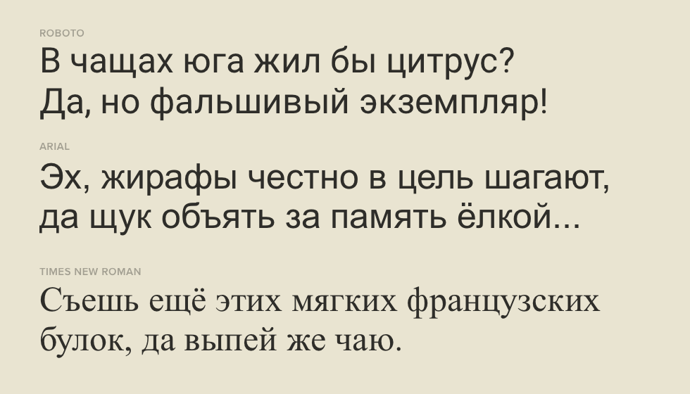
Ruderman: for example, Arial, Times New Roman.
Ostromentsky: for example, the font that stands in the “Medusa” set ( PF Regal, they, including them, are scored - approx. Medusa ). The fact is that Latin people unfortunately do not feel how to draw the Cyrillic letter “K” correctly, how it differs from Latin. Or how to write the letter "h", for example.
- What are the most popular bad fonts? Although you seem to answer this question - Arial and Times New Roman?
Ostromentsky: No. This is Roboto, unfortunately. I believe that the authority of Google works here ( Roboto font has been released by Google - approx. Medusa ), which is large, well -known, and it seems that shit should not offer. And there is very bad Cyrillic. And since it is also free, it immediately gets much widespread.
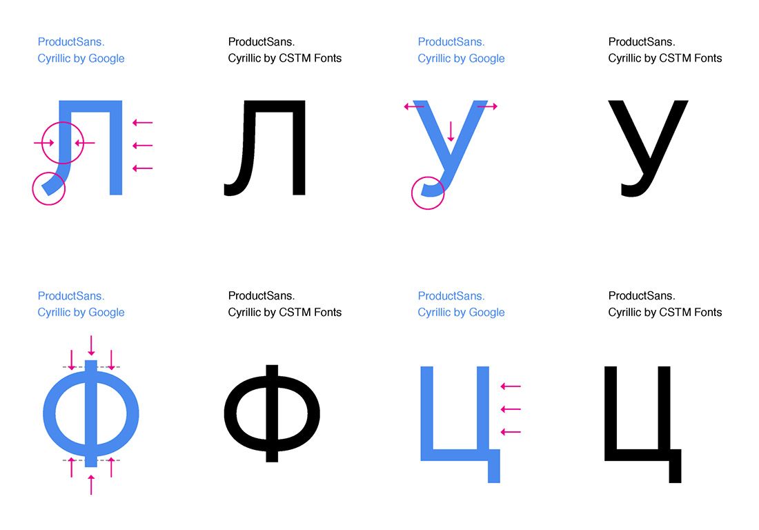
Ruderman: I do not agree. I believe that still Arial with Times New Roman in the Cyrillic version are the most dangerous. There is a well -known phrase of our senior colleague Susanna Lichko: "We read best that we read the most." That is, the fonts used by the user more times begin to influence the reader's habit. He begins to see certain signs more and more often, and thereby expects from other fonts of the same logic. For example: the letter "L" in Arial is similar to "P". This influence is so large -scale and so important that many font Western designers begin to look at Arial and do the same, out of ignorance. Users themselves sometimes choose the letter “L” as in the LDPR logo, roughly speaking. Only there they showed a bit, but it doesn’t matter. And they believe that this is good. The most used fonts - Arial and Times New Roman - turn out to be the most dangerous for the font culture.
- Are they terrible?
Ruderman: No. Each of them has a certain number of incorrectly drawn signs that make their use dangerous.
- How did it happen?
Ruderman: Someone did not give a damn about how in some distant Russia the Cyrillic version of Arial and Times New Roman would look.
“That is, Bill Gates is to blame.”
Ruderman: Yes. When Microsoft released his operating system and supplied it - there was such a term - system fonts, they needed to make several fonts in a very short time with a maximum language set. Here, in fact, Arial and Times New Roman have become one of these. It was sketched, as it was sketched. Like, then we will figure it out. But no one began to understand, it was recorded and now affects our habits, because Arial we have just on every corner. We have the entire navigation system on Arial.
- In general, there are examples of mass fonts that are good?
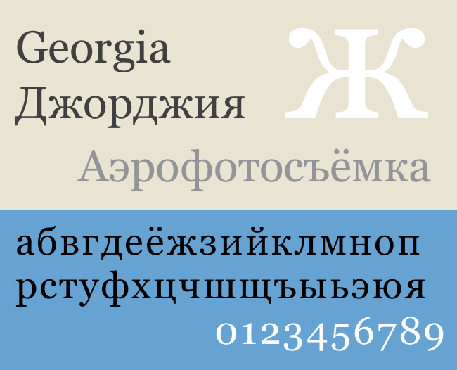
Ostromentsky: Georgia. There are a number of fonts that exist approximately on systemic rights, which was drawn by designer Matthew Carter. Which just, in an amazing way, one of the few Latin designers understands in Cyrillic. True, Maxim Zhukov helped him. It is important to give a link.
- What fonts affected the world most?
Ruderman: The most famous is “Roman capital”. This is the most popular of very old fonts.
Ostromentsky: which is from the column of Trajan. The most actually affects the column of Trajan, because she determined how we read.
Ruderman: We must understand that each group of fonts has its own ancestor. The antique fonts have a column of Trajan, in the lowercase signs - the Carolingian minuscule and Ald man of Manuration. There are grotesque cells, and there, probably, a font Akzidenz Grotesque, which is a little over 100 years old, will be there.
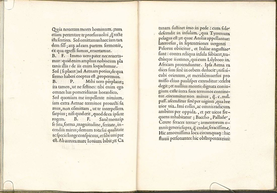
Ostromentsky: The way different letters look-with serifs, without serifs, Chinese, Latin, Cyrillic-they are affected by politics, somewhere Renaissance, somewhere science, and somewhere suddenly a designer. That is, some designer came up with: “And let's not draw letters with surplus anymore, let's no longer contrast in them, and it will be cool.”
- When it happened?
Ostromentsky: this happened at the end of the 19th century, and now we have fonts Arial, Helvetica and Proxima Nova ( the Proxima Nova font is used by Medusa, for example, in the headings and names in the menu - approx. Medusa ).
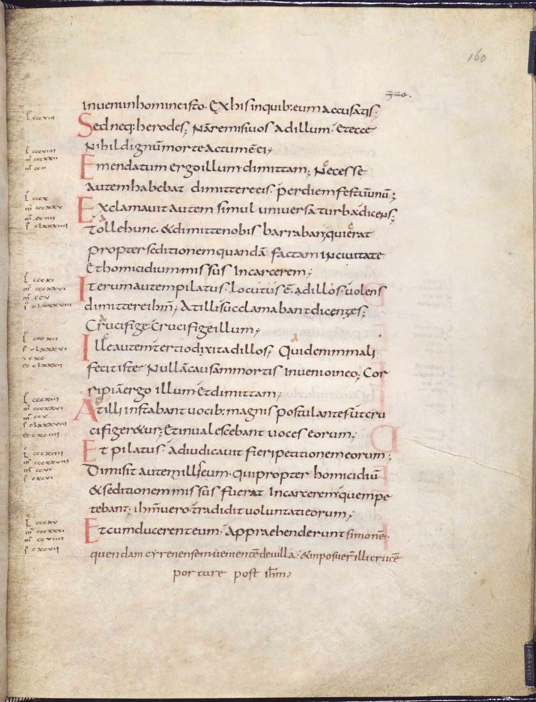
- And how did politics, economics and science affect fonts before?
Ostromentsky: the economy influenced fonts very simply, along with technological progress. At first, fonts were painted with sticks, knocked out in stone, wrote with their hands, then they figured out that they could be printed. They began to be cut with wood. Then they came up with that they can be cast in metal. And then it rushed.
- How did politics influence?
Ruderman: For most of the centuries, the politician limited the number of printing houses, and in almost every country private printing houses were prohibited - because private printing houses are clearly connected with private media, freedom of choice, freedom of speech, and so on. And as soon as for some liberal reasons, this ban was shot, fonts bloomed fantastically: new printing houses, new customers, new font needs.
Ostromentsky: Again, the fact that we wrote to Peter with a charter, a half-steam, this is that the Russians were baptized in Constantinople, and not in Rome. And, for example, the same Hungary, which all the time passed from one hand to others. They either wrote Latin, then Cyrillic, or some very strange Latin, similar to Cyrillic.
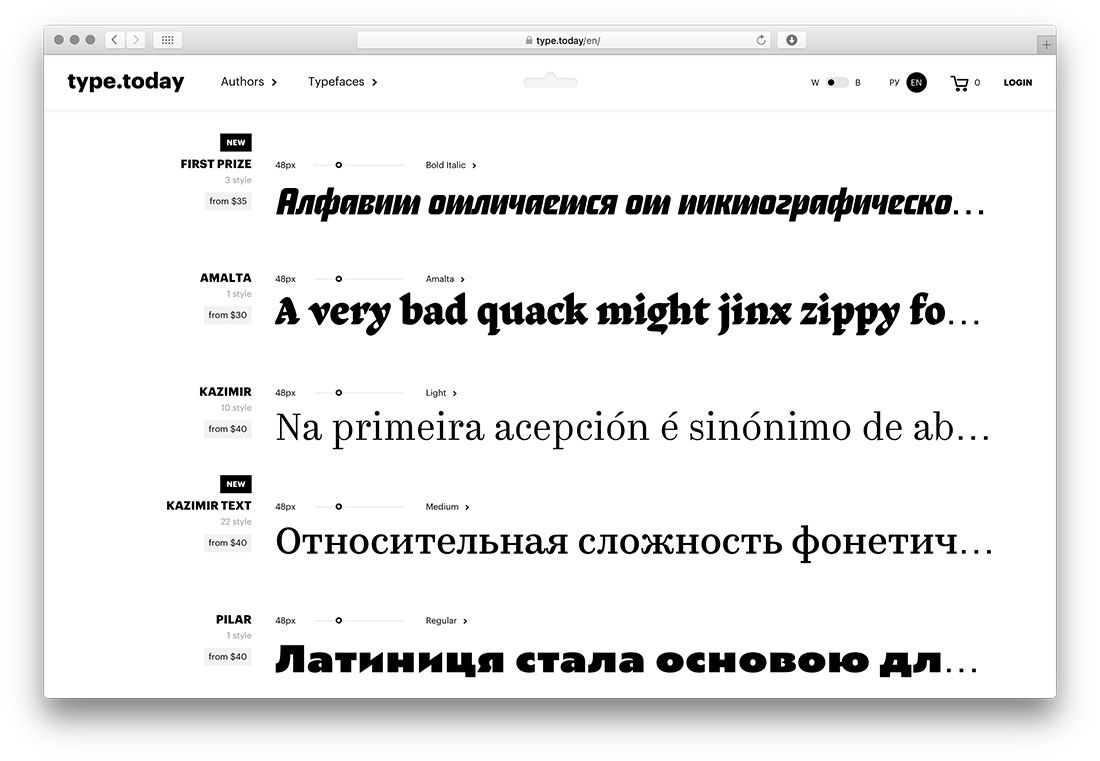
- How did the digital revolution affect fonts? From the side it seems that this is one of the most conservative professions in the world.
Ruderman: The ability to produce fonts on such a scale as now, people working 20-30 years ago were simply beyond the power. We work at fantastic speeds, we make huge families of fonts using new technologies - interpolation, for example. With the help of computer modeling, roughly speaking, the entire spectrum of intermediate spectacles is born from several extremely saturation of drawings. The font is experiencing its rebirth. Latin fonts now, probably, there are thousands of hundred, maybe even more. In fact, we are now experiencing not only the heyday of technology, but we are also experiencing a fantastic number of new products - there have never been such a design diversity in the world. It is very important to imagine how fast the path became from the desire to draw a font to the possibility of drawing a font. In the era of a metal set, this path could be a length of life. That is, it was necessary to start studying, going through courses and understanding how it would work, grow to the right position so that your design was considered, and so on. Now it’s enough to buy a computer, sit down and draw.
- Excuse me, I can’t help but ask this question. How do you feel about Comic Sans?
Ostromentsky: I love him. He is cool.
Ruderman: I have nothing to do with him, I have never used it, and in general, for sure he is good and good, just for me, thank God, I did not have to engage in such a design.
- Okay, good. And the last question: how do you feel about the phrase "play with fonts"?
Ruderman: I usually put the phone on this.
Ostromentsky: Well, this is a difficult question, stop.
Ilya Dewarer
Moscow