
Translated material
Instagram updated the logo and design
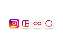
The Instagram photo service for the first time since founding in 2010 held a large -scale redesign, changing the logo and the appearance of the main application. In addition, the company has updated the Layout, HyperLapse and Boomerang applications logos, leading them to uniformity. All innovations are reported on the Instagram blog .
The usual Instagram logo in the form of a retro -chamber Polaroid OneStep has undergone significant changes. The image of the camera has become smaller and more schematic, and now it is located on a gradient background. In the company, this background is called the "rainbow with the gradient effect", although not all the colors of the rainbow from the original service logo are presented in it.
“In the process of work, we asked our colleagues in the company in five seconds from memory to reproduce the Instagram logo. Almost everyone painted a rainbow, lens and viewfinder. Armed with this information, we decided to recreate these elements in a more modern icon, observing the balance between recognition and diversity,” TJ quotes the head of the Yen Spalter design head.
As for the design of the Instagram application itself, it was made black and white with red accents. "The simpler design allows you to focus on your photos and videos without changes in the application navigation," the company said in a message.
Recall that in March, Instagram developers announced that the service will soon abandon the chronological principle of forming friends of friends and introduce a new mode in which the position of publications in the tape will depend on how interesting the Instagram algorithm considers them to be.
According to statistics, the number of active Instagram users is 400 million people. Every day, the service publishes 80 million photos and videos, and the total number of publications exceeds 40 billion. Every day, Instagram users put 3.5 billion likes to publications.