
Translated material
“The site has become sadder and gloomier”
Pavel Durov - about the new design of VKontakte
The social network VKontakte has transferred all its users to a new design, introduced in April 2016. The leading developer of the social network, Vadim Dorokhov, said that in 4.5 months, 2.5 thousand major and minor corrections were made to the appearance of the site. “The site has become visually wider and easier to understand,” says Dorokhov. The founder and former head of VKontakte, Pavel Durov, does not agree with him: he published a list of seven complaints about the new site design. "Medusa" briefly retells them.
Pavel Durov is the founder of VKontakte. For a long time he owned a significant part of the shares of the social network, but gradually he got rid of them. At the beginning of 2014, he sold the remaining 12 percent of his shares and explained that he did this under pressure from the FSB (the social network eventually came completely under the control of Mail.Ru Group). Until April 2014, Durov remained the head of VKontakte. Durov's resignation from the post of general director of the company occurred as a result of a series of unusual steps by the manager: he wrote a letter of resignation of his own free will, then declared his decision a joke, but in the end did not withdraw his letter. After leaving VKontakte, he left Russia and is developing the Telegram messenger. Previously, he repeatedly criticized the development strategy of the social network.
1. The news feed has become narrower.
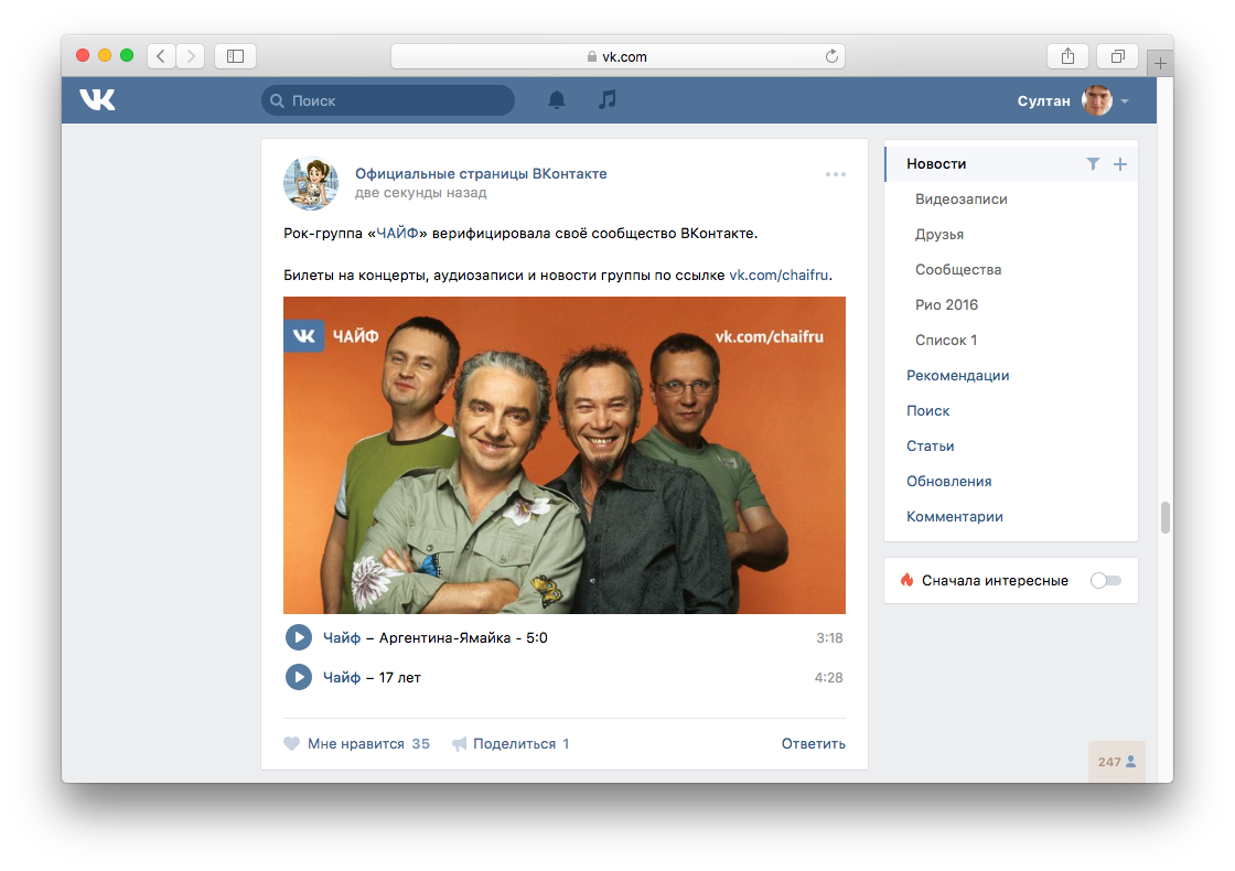
Despite the general “expansion” of the site interface, the main section – “News” – has become 28 pixels narrower.
2. The site has become more crowded.
In the new design, the site header is “glued” to the top of the screen, taking 42 vertical pixels away from the content. “The vertical space of the site has become smaller, you need to scroll more,” writes Durov.
3. Reading the news has become harder.
Now, when scrolling through the news feed, a block with buttons for moving to other sections remains on the right. According to Durov, this takes the focus off the social network’s content.
4. Viewing photos has become like Facebook.
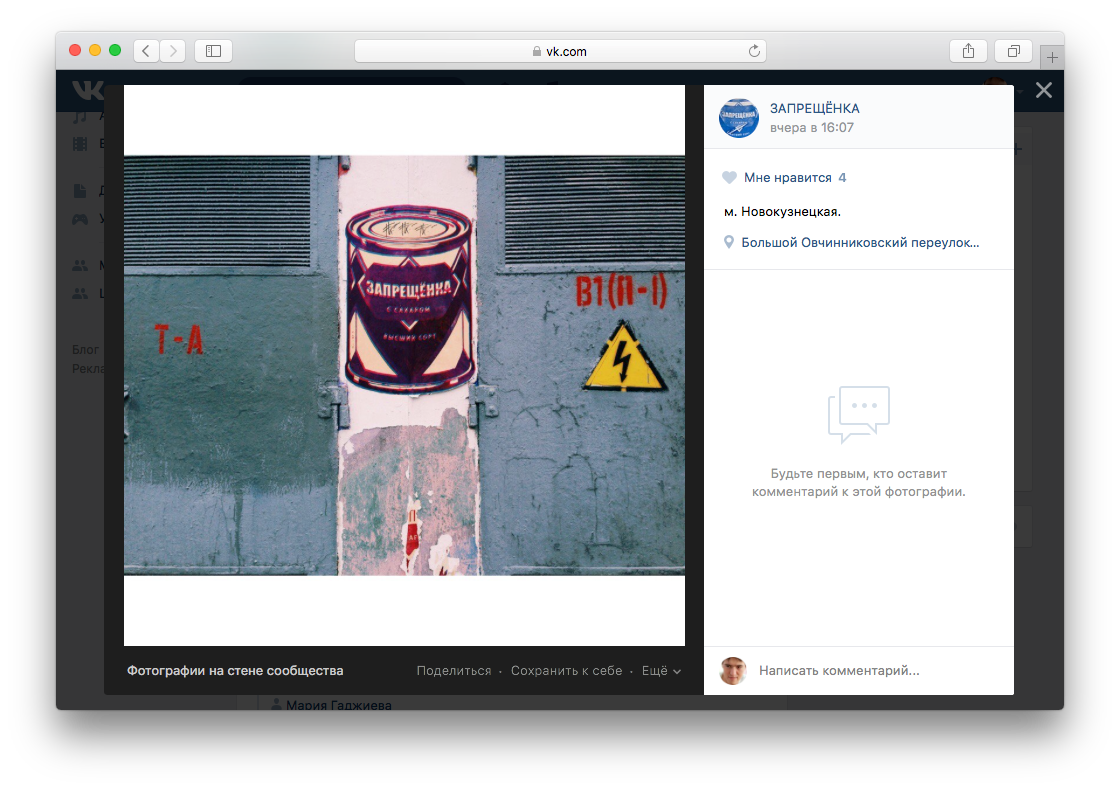
In the old design, the photo appeared in the center of the screen, and the comment box was below (most often you had to scroll the page to get to them). Now the comments are located to the right of the photo and are immediately visible. Durov notes that this solution was copied from Facebook, which inserts additional advertising into the right block. In his opinion, this approach takes the focus off the photograph.
5. Viewing personal pages has become more inconvenient.
In the new design of VKontakte, when scrolling through the content of a user’s personal page, a block with his photographs and videos always remains on the left. Previously, as soon as a block ended, publications expanded to the full width of the column, making reading the archive of posts more convenient.
6. The site has become gray and sad.
The white background of the site has become grey. Durov believes that this “not only reduced the feeling of cleanliness and minimalism, but also overall made the site sadder and gloomier.”
7. The old logo was better.
Finally, the former general director of VKontakte believes that the old logo—the letter “B” on a white background and “contact” on a blue background—fitted better into the site’s header than the new one, which looked like an eagle (though the “new” one, like the “old one,” have existed for many years).
All of the listed elements of the new design were blindly copied from Facebook in 2012. In 2016, Facebook was supposed to copy the developments of VKontakte, and not vice versa...>