
Translated material
"Suitable for the brand bidet"
Juventus introduced a new logo. And the fans did not like him very much
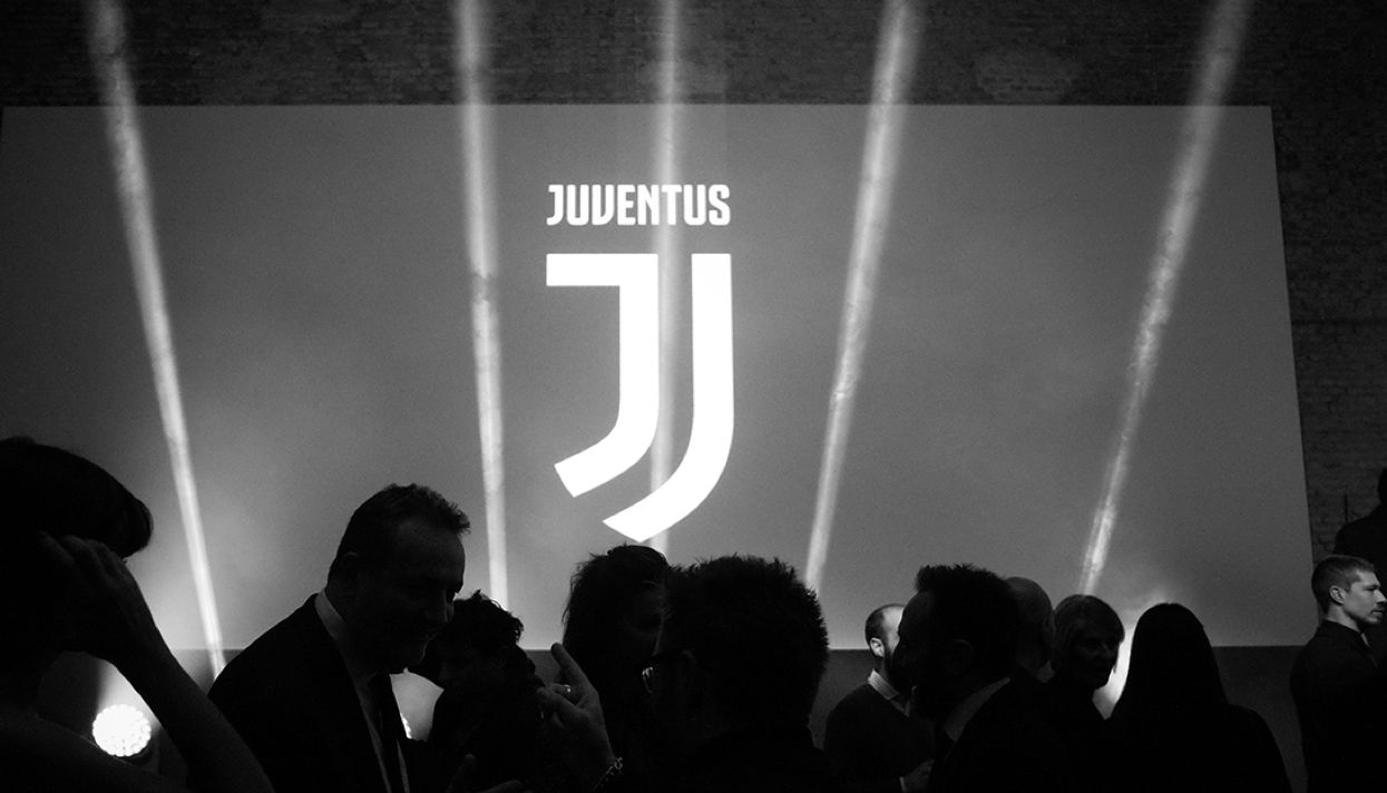
Turin Juventus, one of the most popular football clubs in the world, introduced a new logo - instead of a traditional coat of arms with a crown and a bull, which refers to the coat of arms of Turin, there will now be modern graphics on the T -shirts of football players. The leadership of Juventus connects great hopes with the logo, but the old fans accepted the innovation with hostility: they do not like that the logo is no longer connected with the history of the city and that it is clearly oriented towards the Asian market.
From the standpoint of the club’s leadership, the Promo Roller, who was removed to the presentation, speaks best of the Juventus’s new logo. The Turin club leaves its traditional black and white colors, but changes their filling: the new logo has become ultra-modern, easily recalled and equally easily reproducible; Something he resembles Emoji.
Juventus sees in the new logo of the “DNA of the Club”: stripes on a T -shirt, a reference to Skudetto (the main trophy in Italian football) and the letter J (from Juventus). At the presentation, a lot of attention was also paid to the fact that the language of football is universal - and should be clear all over the world. For those who grieve by the absence of the coat of arms, a hint of the shield was left - in the right side of the logo.
Juventus fans did not like the new logo. To start at least with the fact that his presentation was not in Turin, but in Milan, where several historical rivals of Juventus - Milan and Inter (and the logo itself developed Interbrand) is based at once. In addition, in the logo they found a lot of reasons for jokes.
“The logo that heaters like only like,” one of the articles on Corriere Della Sera came out with such a headline. In it, the author directly says: “They have the strongest team and the largest community [fans] in Italy. And also - the most terrible logo in the world. For us, anti -Juventions, this is a great sight. ”
“12 things that Juventus logo are more suitable,” the Italian version of the Vice publication is mocking the Turin club. Among others, Mark Bida and Sushi-Bar, filled with students of law faculties, are named there.
The Internet did not stand aside. He has several fresh ideas for Juventus, here are just a few of them:
Well, of course, there were no hints of borrowing (on the left - a logo depicted on RS Tennis tennis balls).
Already on January 22, Juventus play in Turin with Lazio. It is possible that the fans will talk about the new logo directly from the stands.