
Translated material
How to choose a font
Instructions of the Medusa art director Sergei Surganov
Often you have to deal with a situation where you need to choose a font: for presentation, ads, congratulations, resume or for your own site. The Medusa art director Sergei Surganov wrote instructions on how and where to find a suitable font and how to use it correctly.
1. Understand the types of fonts
There are many different font classifications. All of them contradict each other, so that it is easy to get confused in them. The simplest classification looks something like this: there are fonts with cuttings (antiqua), without serifs (grotes) and everyone else.
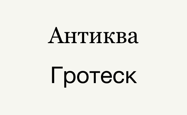
The last group includes handwritten fonts (they imitate handwriting or calligraphy), monoshridin (as in printed machines or in the code editor), symbolic (badges, symbols, emoji) and excitement - this is the name of any decorative fonts for decorating large inscriptions, headings and logos.
Short. There are two main groups of fonts - antiques and grotesque. Antikva is fonts with serifs, grotesque - without serifs.
2. Use a font with cuttings for long texts
When you make out any long text (article, resume, letter, instructions), it is worth using a font with cuttings, that is, antiques. It is believed that a long text filled with this font is easier to read. In traditional book layout, it is anti-kvi that is also used, so if you are doing something similar, then the choice is clear.
If you use Windows, among antiques a good choice will be Georgia (such a font is used on The New York Times) or Garamond (classic antique, which comes with Microsoft Office). The Mac OS also has Georgia, as well as the beautiful Iown Old Style (one of the fonts in the reader IBOOKS), Charter (which is well suited for printing in small size) and PT Serif (it can be downloaded for free for Windows).
Short. A font with cuttings is well suited for a set of long texts. On Windows, use Georgia or Garamond, and on the Mac OS - Iown Old Style or Charter.
3. Use a font without cuttings for short texts
Fonts without serifs, that is, grotesque, surround us everywhere - they are used on sites, in interfaces, logos, advertising, navigation, packaging, and even in books. Since the end of the 19th century, this type of fonts is associated with everything modern, so if you make a slide presentation or choose a font for the logo of your new company, feel free to use the grotesque.
For Windows users, you can recommend standard Verdana, Tahoma and Segoe UI (and please, no Arial and Calibri!). Mac OS users to the already mentioned Verdana and Tahoma are also added by Helvetica Neue and Helvetica (they even shot a whole film about this font). And here is the excellent San Francisco, the new Apple company font, which is used in all interfaces, packaging and recently on the official website, for some reason is not available for use by default inside the system, so you have to download and install it separately .
Short. Use a font without cuttings for everything that is not a long text. On Windows, use Verdana or Tahoma, and on Mac OS - the same or Helvetica Neue.
4. Download free fonts
It is unlikely that you can do with only standard fonts. Fortunately, on the Internet it is easy to find quite a lot of free fonts - and not pirate at the same time! It can be just a free font, the work of a novice font or amateur, a promotion in a store or a trial version.
The most obvious place where it is worth looking for free fonts is, of course, Google Fonts, where 76 Cyrillic font families are currently available (each family includes several drawings). An unobvious place for finding free fonts-promotions and sales in the largest online store Myfonts , where with the help of an extended search you can find more than a hundred free Cyrillic drawings.
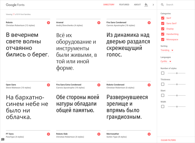
You can also look for free fonts in thematic communities or download trial versions on the sites of font manufacturers - although, unfortunately, this is not the most common practice. And be careful: not all free fonts are high -quality, and not all free fonts can be used for commercial purposes, so read the license.
Short. Make free fonts on Google Fonts, MyFonts or look for them on the Internet. A free font may be poor -quality. Read the license if you are going to use the font for commercial purposes.
5. Buy a font if you want something more
The richest selection of fonts for those who are ready to pay for them. The most popular online font store is Myfonts , in which almost two thousand pieces can be found. You can also advise you to visit the sites in vocabulary (the so -called companies that make fonts): Parachute , Colophon , Radim Pesko , Commerical Type , Grilli Type . Among Russian companies, it can be noted: “Paratayp” , Lebedev studio , Letterhead , Type Today and Brownfox .
Font manufacturers are trying to submit their goods in the most profitable light as possible, so you can go to their sites not even for purchases, but in order to be inspired by examples of use. For example, see how varied it is possible to use some, at first glance, boring grotesque . Even more examples of using the font can be seen on FONTS in USE .
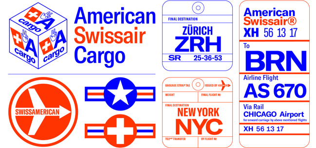
Usually one font drawing costs about 3,000 rubles (it is cheaper and more expensive). And yes, you will have to pay the same amount for a bold or italic style as for the usual one. Fortunately, you can often save by buying the entire font family at once - wholesale is cheaper.
If you use a non-standard font, remember: in order for your file (for example, presentation) it is correctly displayed on someone else's computer, you need to either separately transfer the font or include it inside the excess file.
Short. You can buy fonts on Myfonts or on sites of specific manufacturers. Typically, one font drawing costs about 3,000 rubles.
6. Consider the context of font application
If you dial this paragraph with the font Comic Sans (or any other “cheerful” font), of course, nothing terrible will happen. True, it is worth knowing that this font was originally inspired by the inscriptions from the comics and was used for replicas of the virtual assistant from Microsoft. Outside of this context, Comic Sans looks somewhat strange. Although, as we know, with proper use, this font is literally suitable for everything (joke).
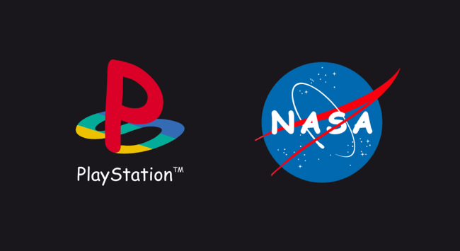
In fact, we want to say that when choosing a font, you need to take into account the context. Do not use Gothic for sign in cafes with donuts, and Slavic ligature - for the logo of the club of eastern martial arts.
Short. Each font was made to solve a certain problem, this should be taken into account when using it.
7. Remember that not everything depends on the choice of font
Perhaps your task is not solved by choosing a “beautiful” font, but by the correct use of the basics of typography. In a reparticular layout, not only the chosen font, but also its size, the inspection (for example, fat or italic), the distance between the lines (interlineage), the distance between the letters (tracking and core), the use of typographic symbols (for example, long dashes and spectacles of the “Christmas trees”), color, composition, visual hierarchy, and the availability of the existence of the distance, the distance. other graphic elements and much more!
You can remember a simple rule: the easier, the better. Moreover, this applies not only to the design, but also by the content itself - as a rule, the simpler the structure of the original text (the presence of all kinds of discharge, headlines and inserts), the easier it is to make it out.
Short. It is not enough just to choose a font, you still need to be able to use it. Do not get carried away with expressive means. The simpler, the better.