
Translated material
MTS rebranded
The Russian telecom operator and the MTS digital service provider showed an updated brand. Changes reflect the company's new strategy for transforming and creating digital products in new markets.
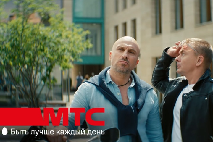
The new MTS slogan is "to be better every day." In the visual style of MTS, it will get rid of the inaccurate Kraft concept (red strip stylized under a brush smear), focusing on more dynamic formats that reflect the orientation on the digital component of the company's business, the company's press service reports. The central element of branding is the red strip growing from the typography of the new MTS logo.
In addition to traditional telecom services, the company's portfolio has financial products based on its own bank; entertainment applications, including ticket services for concert and theatrical performances; The new MTS Home direction, uniting the technology of the Smart House; multi -platform TV, including access to hundreds of television channels through cable, satellite and mobile TV; own e -sports streaming platform; telemedicine platform SmartMed; Smart Education online education application; The Digital B2B direction, combining cloud products, federal sides of the Internet of things, services based on artificial intelligence and Big Data.
“The desire to be better in character is not only for people, but also to brands. The update of the visual style and slogan is a natural process on the path of growth and development of the company, which is the leader of the industry and every day seeks to be better for its customers, partners and shareholders, ”said Vyacheslav Nikolaev, vice president of marketing. - MTS strategy involves the concentration around new digital products. The visual style follows this concept by creating an umbrella brand, which includes new grocery business lines beyond the boundaries of the telecom that will be reflected in the spelling of the brand. ”
The change in positioning is based on the results of more than four global and over 20 point life studies, customer needs, visual test tests for various segments. During the work on new positioning, about 30,000 people throughout Russia were interviewed. New positioning and visual style were created with the support of two agencies: ASVK Consulting Ltd from the UK and BBDO Branding from Russia.