
Translated material
Director of the Institute of Confucius criticized the logo of the celebration of the 75th anniversary of Victory
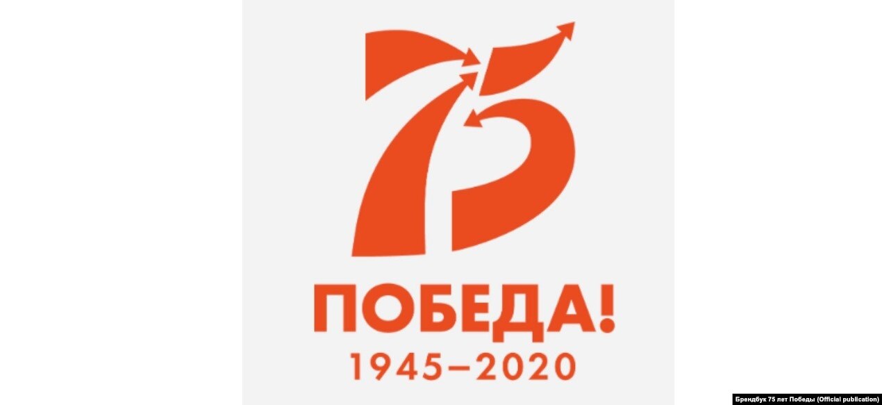
The logo of the celebration of the 75th anniversary of Victory in the Great Patriotic War was criticized by the director of the Institute of Confucius of the Annunciation State Pedagogical University Nikolai Kukharenko. He believes that the arrows on the logo do not symbolize the liberation movement of the Red Army. He wrote about this on his Instagram.
Kukharenko believes that the arrows directed from left to right indicate the movement to the east and show the movement of the fascist troops on the USSR.
"Who is the designer of the logo? Why are the arrows located in the direction from west to east ??? The victorious movement of the Red Army is connected with the liberation from the east to the west! And as on the logo is the movement of the fascist troops on the USSR! The Barbarossian plan. A young designer, a son of an official in London, in whose vocabulary there are only a fashionable English, who is only with a war of war. On computer shooters Call of Duty and Battlefield.
SR in mobile SR on Instagram Wed FacebookUsers in the comments mostly agreed with Kukharenko.
"Apparently, someone liked a beautiful logo with arrows, and the arrows are beautiful only if they are right to the right. And we should think not about beauty, but about historical reliability, especially taking into account the current decline in the level of education of youth."
"How did they approve ?? this cannot be."
"Yes, just the number 75 was so. I think that the person simply did not bother and did not think that the direction of the shooter could be important. But I agree, participate in the process of the editor, would do better."
“Why see some kind of background in everything? These are just the arrows indicating the movements of the troops, a separate detachment, units and a lot more. Just arrows. Someone sees a swastika in them, someone’s movement to the east. I see the number 75-75 years of great victory!”
Wed on YouTube Wed to Yandex.Zen