
Translated material
Kaliningrad
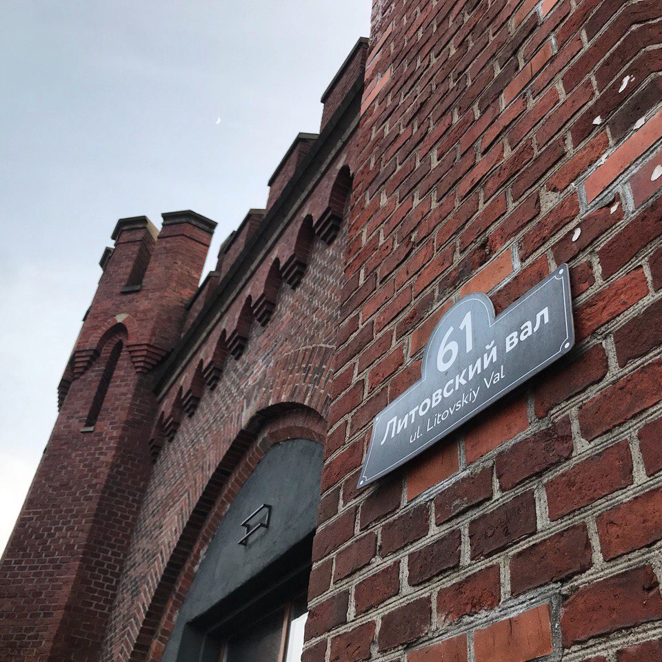
Black address signs:
Embankment:
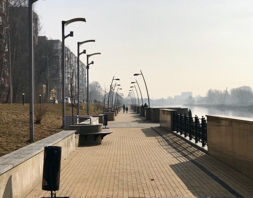
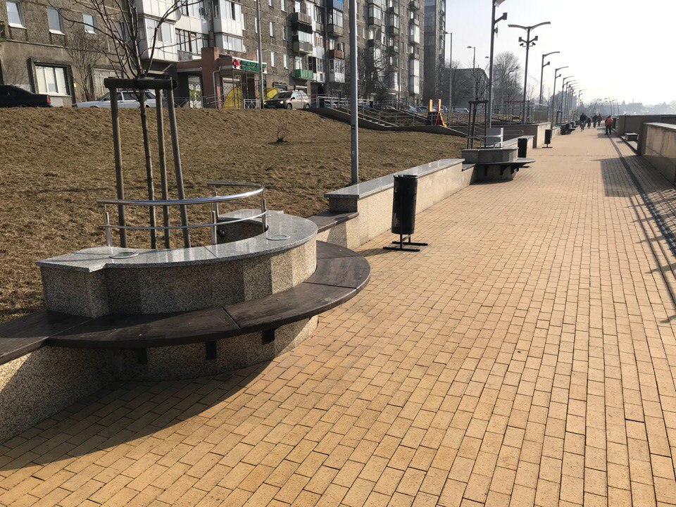
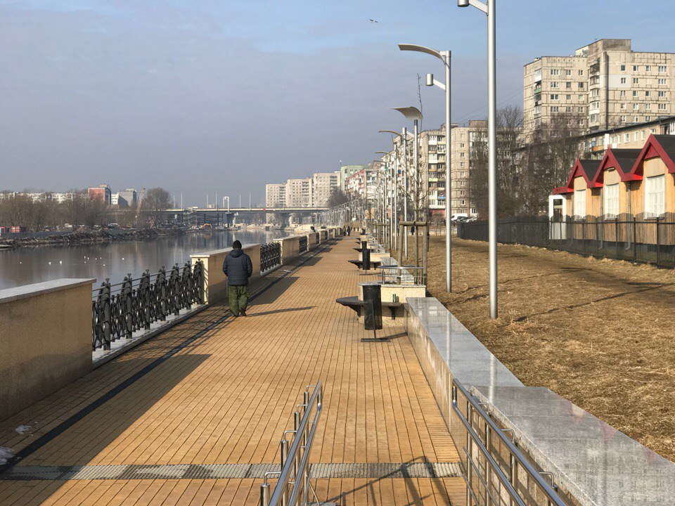
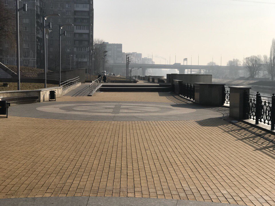
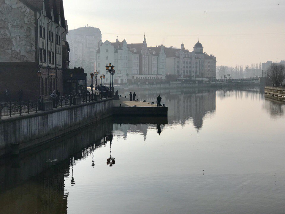
This is the view of the river and landscape if you decide to sit by the water - this is the main problem of the embankment in Kaliningrad:
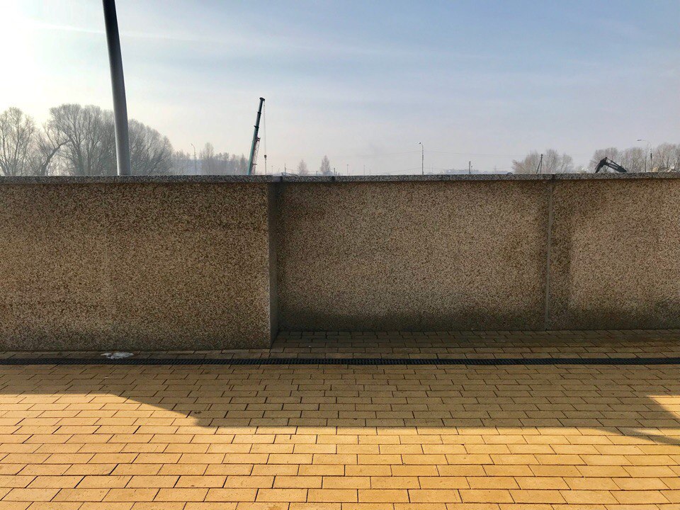
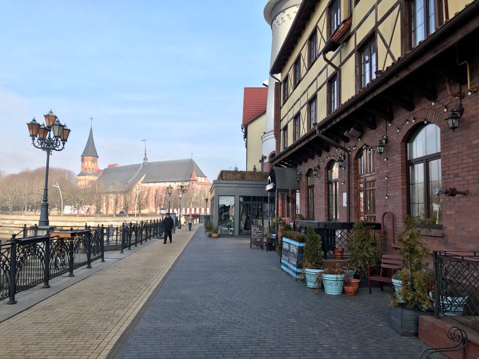
Why is the embankment terrible, despite the fact that it seems clean and fresh? Money. A lot of wasted money. This is the case when you would have spent 3-4 times less, but it would have turned out better.
The main oddity, besides the unnecessary granite walls and cast iron, are the benches that stick out rather than in. Due to a stupid decision, the width of the sidewalk is almost halved when a person sits there.
It’s also impossible for two people to sit and communicate on this semicircle. Oh, well, you can’t lean against it. A granite ledge was carefully provided on the back.
The number of lights is excessive. This is immediately obvious, and the locals confirm that at night it’s blinding both on the catwalk and in the windows.
People need nature. We should try to use as little infrastructure as possible when creating public spaces.
In the case of the Kaliningrad embankment, there is a feeling that the task was to make the project estimate as large as possible. It's sad.
Problems and proposals for their solution:
Greenery on the streets:
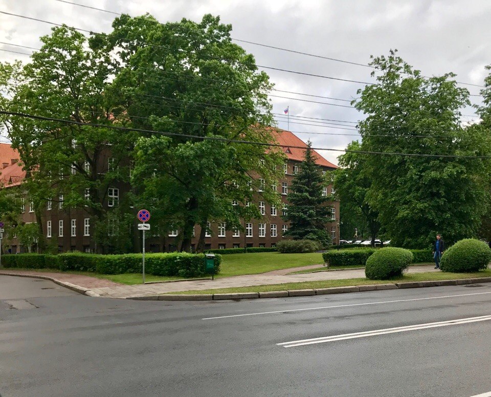
Before your eyes, the result of magic is that common sense and love for the aesthetics of the streets defeated GOST standards and bureaucracy!
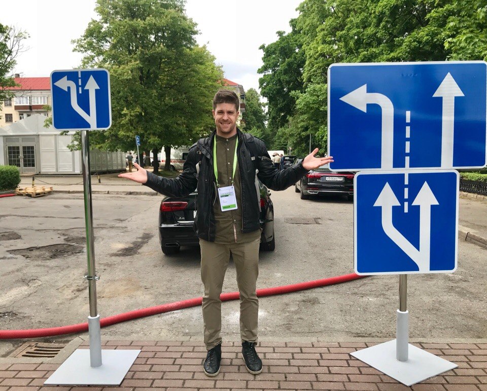
The Ministry of Transport has introduced smaller auxiliary road signs. Look: there is the same sign on both sides. On the right - as it was, on the left - optimized, as it will be:
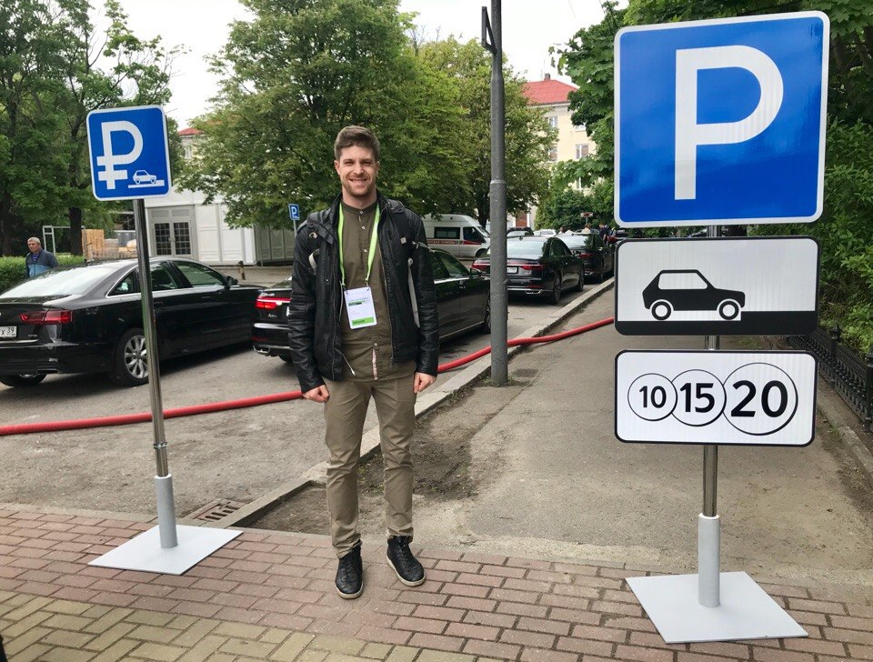
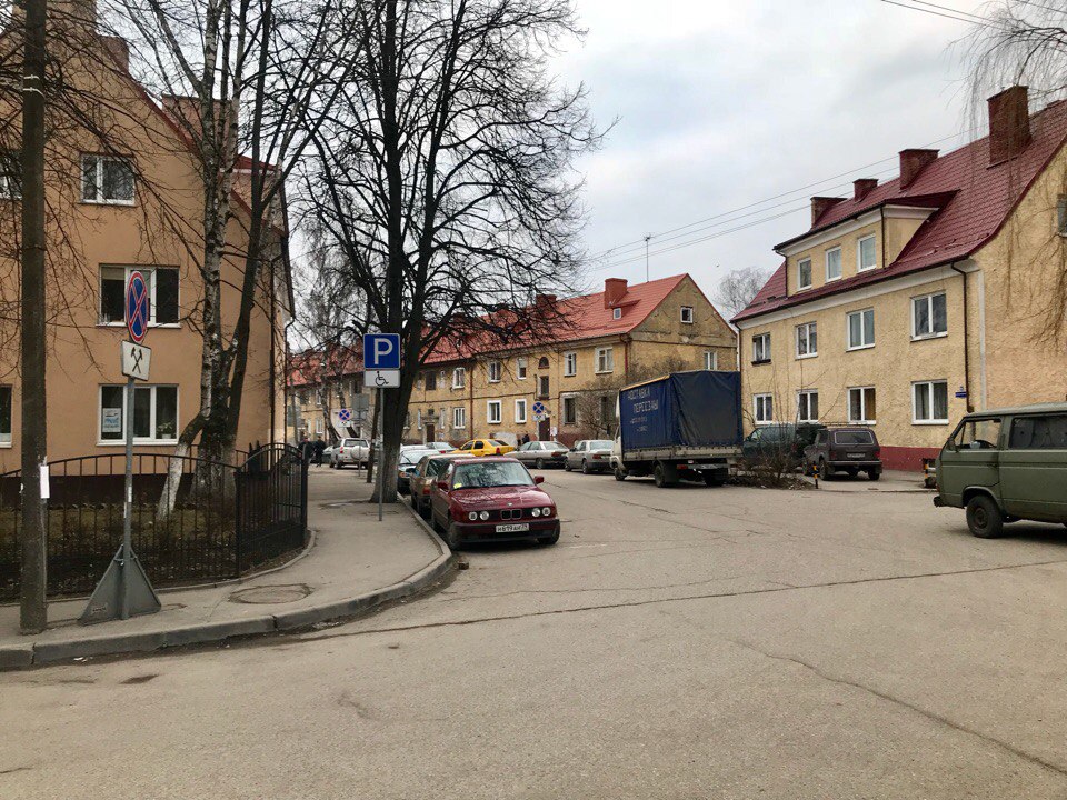
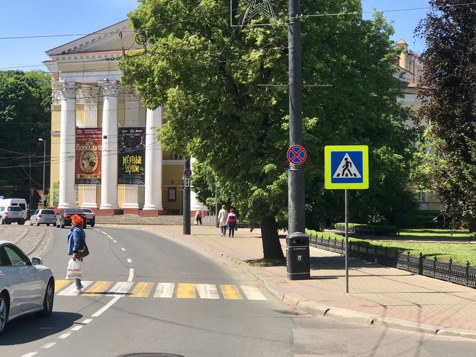
In Kaliningrad, they are putting up smaller “No Parking” signs:
Public space on the embankment: