
Translated material
Opel updated its logo after other automakers (video)
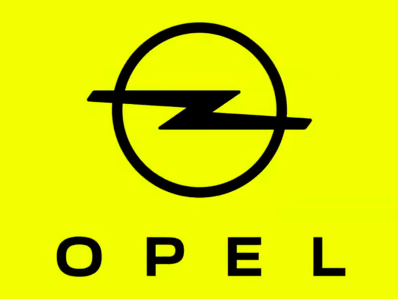
The German company Opel (part of the PSA concern) officially introduced the updated brand logo, as well as corporate yellow and new font. This was written by "Rossiyskaya Gazeta" with reference to the message Opel.
"The purpose of the image update is to look even more modern and bold. After all, Opel has always been a symbol of democratization of innovation and mobility," the company explained. The updated logo has become two -dimensional, and the rim around the lightning icon has become thinner.
The yellow color was chosen as a corporate party, since it symbolizes the era of electrification and is remembered. Finally, a new branded font called Opel Next in the company described as "light and energetic, modern and clear."
The first car on which the Germans will test the new style will be the updated Crossland crossover. In Russia, this car will appear next year, writes RBC .
Recall that over the past couple of years, the logos have been updated in a similar way have been presented by some other automakers, including Toyota , Nissan , Kia , BMW and Volkswagen. Some of these companies have already introduced cars with new logos.