
Translated material
Orientation North
How geographers learned to draw cards: a fragment of Mika Eshvort
People wander around the ground since time immemorial, but they learned to portray its surface on paper (or other suitable surfaces) relatively recently. About how this process developed and how the peoples of the whole world came to a single standard of cartography is described in Mika Ashvort's book “Why North above?”, An excerpt from which we suggest you read.Mick Eshvort. Why North from above? How conventional signs, projections and scale on maps appeared. M.: Paulsen, 2021. Translation from English Z. A. Mamedyarova. Content
 North
North
Orientation up
In 1997, Ashley Sims released the atlas of UK roads, which was designed to solve a long -standing problem: the author claimed that his “inverted map” would “travel easier and safer to travel from north to south.” Half of the cards in the atlas had a regular orientation (north from above), and the other half turned 180 °. It was assumed that this approach would put an end to the need to turn the card in the hands in order to read the names and understand when to make a left turn, and when - the right one.
This approach may seem very unconventional; However, there is no clear rule that defines how the map should be located - because the Earth has neither a top nor a bottom. The tradition of depicting north on top of the North has become generally accepted only in the XIX century. Prior to this, cartographers had images on maps in different directions, often more likely to follow cultural and religious traditions than geographical and other scientific rules.
The word “navigate” comes from the Latin “Oriens”, which means “East”, since it was the East that was in the upper part of many ancient cards. Apparently, the top of the card was always considered more significant than the bottom, and therefore the side of the world was located in the upper part, in the direction of which there were objects important for the dominant culture and system of beliefs, for example, the emperor’s residence (which is supposed to look at the bottom up ”), Mecca, Supple, Polar Star, Paradise. It is expressed that, after the tradition of depicting the north above, the northern hemisphere has become more important than the south.
First of all, to arrange images on the maps in accordance with the cardinal points of steel in ancient Mesopotamia. The first famous map, focused on the east, is a Nuzi map (now Yorgan-Tepe, Iraq), cut out on a stone about 2300 BC. e. On most ancient Greek and ancient Roman cards, the north was depicted at the top, however, on the early maps of Rome cut on marble slabs, for example, on the “marble plan of the city” (c. 203–208 AD), there was a southwest at the top-the main city sanctuary was in this direction. The ancient Chinese cards were usually oriented to the north, which may be explained by the invention of the magnetic compass during the Han dynasty.
On the oldest of the preserved cards with a realistic image of Britain - the Anglo -Saxon map of the world, or Mappa Mundi (1025–1050), the East was at the top. European Christian maps of the Middle Ages, including, perhaps, the most famous map of that time, the Hereford map of the world, placed on top of Eden, or paradise, which was believed to be east of Europe; In the center of the map, Jerusalem was depicted. Arab cards, for example, the Al-Yidrisi map, on the contrary, placed the south on top of the south in the religion of Zoroastrianism, as well as the direction to Mecca from Baghdad and other important cultural centers of the Middle East.
The transition to cards with the north upstairs was due to three key factors: in the XII century. A magnetic compass came to Europe from China; In the XV century. The work of Claudius Ptolemy (c. 100 - approx. 170 n.) were re -opened; In 1569, Gerard Mercator compiled his famous map of the world. As the navigation in the era of great geographical discoveries and the increasingly wider application of Ptolemy of the “scientific” approach, other methods of displaying the cardinal points on the maps began to be replaced, and the priority was quite logically given to the “scientific” approach. This tradition was fixed by the emergence of a mercator map oriented to the north and made in a projection, which led to a coup in navigation methods. Representatives of different peoples and cultures were increasingly sharing geographical knowledge with each other; Marine cards, compiled in different countries and according to different rules, were found more and wider application - all this strengthened the need for standardization of maps.
Nevertheless, the rules exist to violate them, and cartographers often depart from the traditional image of the North from above. One of these examples is “Universal adjusted map of the world MacArthur”, where the south is depicted from above. Published in Australia in 1979, it is allegedly called upon to "save our great, but deprived of attention to the country from obscurity ... and put it on its rightful place - above the northern neighbors." Australia on this map was located on top - which means that no one could afford a joke that it is below.
Whatever we are guided by-common sense, political or religious beliefs-now we have the opportunity to turn the card in our phone or navigator in the direction of movement, pressing the one-single button. Today, orientation to the north is not so important for card users-after all, Google cards turn the world upside down in many ways. Perhaps, in the past, Ashley Simsa did not take seriously, but now it seems that he looked into the future, anticipating the need to choose the orientation of the card in accordance with our needs.
Latitude and longitude
Location, location, location
Thanks to the global positioning system (GPS - Global Positioning System), we can determine our exact coordinates, being anywhere in the planet. But the numbers denoting our location, for example, 51 ° 45´14.7˝ s. Sh. and 1 ° 15´14.6˝ s. d. (coordinates of the Bodlian library in Oxford), under a different combination of circumstances, could be completely different.
The breadth is determined relative to the plane passing through the center of the Earth perpendicular to the axis of its rotation. When crossing with the surface of the Earth, this plane forms a line called the equator, which is at zero latitude. The plane parallel to the equator cross the surface of the earth, forming a series of latitudes, or parallels. The angle between the equator and these lines determines their latitude to the north and south of the equator. The maximum latitude - 90 ° - corresponds to the poles.
Similar imaginary lines, called meridians, go from north to south perpendicular to parallels and converge at one point on the poles. The corner measure of these meridians relatively a certain reference point is called longitude. While breadth is a natural coordinate, measured relative to the equator, longitude is subjective, based on the accidental choice of the “first” meridian, regarding which it is determined.
The principle of determining the location according to the system of meridians and parallels was proposed by ancient Greek geographers, mathematicians and astronomers, in particular the Dikerch of Messena (360 - c. 290 BC), Eratosthenes of Kirensky (c. 275 - c. 194 BC) and the GIPPPARCH (C. n. But most often the founder of this method is considered by Claudius Ptolemy from Alexandria (c. 100 - c. 170 N. E.). In the "Guide to Geography", written in approx. 150 g. e., Ptolemy used the coordinate system to determine the location of all geographical objects known at that time. Although the maps he had drawn up was not preserved, in the Middle Ages his system was re -opened and translated into European languages, after which it was adopted as a basis for cartographers of the Arab world and Europe, and later also China and Japan. In addition to the cards used in the work of Ptolemy, the earliest “modern” world map with reference to latitude and longitude was compiled in 1490 by Hinrich Hammer (Henry Martell Herman), which worked in Florence.
Since the counting point of longitude could be chosen to its taste - either using an arbitrary position, or following the existing traditions, Ptolemy determined the position of zero meridian in the Canary Islands, which at that time were the most western of the well -known geographical objects of the Earth. When in the era of great geographical discoveries, in the XV - XVIII centuries, the sailors advanced further west, the countdown began to be carried out from other objects selected not in such an arbitrary way. The emergence of more advanced methods for determining latitude and especially longitude (the longitude in the sea became possible to accurately measure only after creating chronometers in the middle of the 18th century, in particular John Harrison H4, who in 1761 brought his inventor a solid bonus), changed the map of the world to recognition: its content and the accuracy of the objects were adjusted.
The variety of maps in different countries has led to a large number of zero meridians - by the end of the 19th century. There were more than 20 points, from which the longitude was counted. It is logical that countries - often for political reasons - placed these points in their own territory. During the compilation of cards, Cadiz, Copenhagen, Jerusalem, Paris, Naples, Berlin, Ceylon, Rio de Janeirife, Tenerife and even the house of the famous Japanese cartographer of the 18th century served. Such disagreement was a serious danger to navigators - because they sometimes used cards compiled in different countries, with different coordinate systems.
Only in 1884 in Washington, an international meridian conference was held in Washington, in which representatives of 25 countries participated. The conference was to determine the "meridian, which will become a single zero longitude and the reference point of standard time around the world." As a result, Meridian was chosen, passing through the Greenwich Observatory in London. Since then, we have been counting the longitude to the east and the west of Greenwich.
Cartographic projections
Distortion of the Earth
Removing the peel from the orange, we illustrate the most important problem of cartography. No matter how carefully we clean the orange, the peel cannot be laid out on the table with a single plane. It will be divided into fragments between which gaps will arise. The task of projecting an almost spherical three -dimensional object on a two -dimensional plane of the card has always been difficult for cartographers.
Cartographic projections go back to the Hipparchus, and the mathematical approach to solving the problem was proposed later, in particular Marina Tirsky (70–130 N. E.). But the revolution in the theory and practice of projecting was produced by Gerard Mercator (1512–1594), which in 1569 compiled a map of the world that was of great importance for the development of cartography. Since then, especially in the 18th century, many types of cartographic projections have appeared.
The term “projection” was introduced into circulation during the creation of various methods of depicting the Earth on the plane. Imagine how a light bulb is placed in a transparent globe to project the outlines of a coordinate net on a sheet of paper attached to the globe. Depending on exactly where the light bulb is located - in the center of the globe, on the opposite sheet of surface paper or at a certain distance from the sheet - the coordinate mesh folds into a certain pattern, which shows us how the projection is performed and how the surface of the globe is distorted. Meridians are not always found at the poles, parallels are not necessarily parallel to each other, and the poles sometimes turn from points into the line. In addition, the pattern depends on the shape of the sheet on which the projection is performed. The projections are called cylindrical (when the paper is wrapped around the globe), conical (when a paper cone is put on the globe) and azimulan (when a flat sheet of paper touches the globe at one point). Additional complexity is the fact that the scale of the card is true only at the point where the paper touches the globe (or passes through it). There are infinitely many projections. Whatever approach we choose, it is quite obvious that when projecting land on a flat surface, we have to distort forms, adjust the areas and change the corners and directions.
A great illustration of this is the Mercator map. In its cylindrical projection, which is widely used to this day, any straight line corresponds to the location - the line of constant compass azimuth; This was very important for navigation in those days when travelers began to leave further and further from the house. But you have to pay for such convenience: the Mercator card significantly distorts the size. In modern versions of the Greenland card, it is comparable to South America, although in fact the last area is almost eight times larger. In the time of the Mercator, not so much the true size of the continents were important as the simplicity of navigation; But today we need “equivalent” projections to conduct reliable geographical comparisons.
However, such distortions can be used for the good. Modern cartographers have the opportunity to choose from many projections with various characteristics and find a compromise in order to minimize distortions. The projections can be divided into equangible ones (retaining correct corners, and with them forms), equal (exactly representing areas) and equidistant (exactly showing distances from a particular point). The cartographer selects a suitable projection depending on the main purpose of the card. So, an equal-angle projection, correctly reflecting the forms, but distorting the area, is not suitable, for example, for the density of the density of any indicator.
In 1973, the German writer, director and public activist Arno Peters attracted attention to these issues, creating an equal projection, which, according to him, corrected the error in the display of developing countries on the world maps. In particular, the projection of the Mercator exaggerated (although rather by chance than intentionally) the area of the territories of wealthy Western countries, and Peters stated that its use does not work in the interests of developing countries. His card - although the cartographers quickly learned in it an almost accurate copy of the projection of James Galla, proposed in 1855 - began to be used by many international organizations, including the UN.
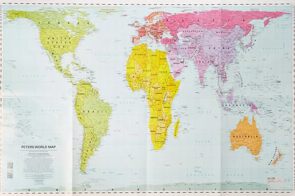 Map of Arno Peters (1973). Source
The projection of Peters is recognizable by strange elongated forms of continents and is very controversial; However, thanks to her, many first learned about the distortions characteristic of cartographic projections and their influence on our idea of the world.