
Translated material
Today's Roginsky
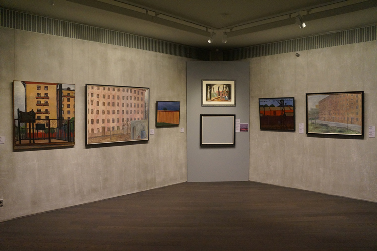
The exhibition of Mikhail Roginsky , which is held at the In Artibus fund, at first glance, as if a detective is playing before the viewer. Almost immediately, here you stumble on an empty frame, around which other works of the artist are placed. Next to it is also a label with information that the work is “pink fence. The rails ”(1963) went to France, to the collection of the Pompido Center , along with other 249 works of Russian post -war art. This occasion, apparently, motivated the fund to collect in its space a picture of an artist from private collections. Hence the obvious, but therefore no less dramatic name of the exhibition - “Farewell to the“ Pink Fence ””, which, in its plan, seems to be conceived as the paraphrase of the name of the famous military march, whose melody and to this day sometimes sounds at stations.
Several dozen works of Mikhail Roginsky collected here are an approximate range of his artistic practice. About how important and significant its painting is, here you can make at least the most superficial impression. For several years, Inna Bazhenova, until recently, the owner of the “pink fence”, the president of the Roginsky Foundation and the founder of the IN Foundation Artibus , helps to revise and re -evaluate the meaning of his heritage. So, in 2014, the efforts of the Roginsky Foundation in Venice opened a personal exhibition of the artist, the first large retrospective since his death. If at that difficult moment the red “door” (1965), the presence of which could be easily interpreted in the framework of the rhetoric of the Cold War and the Iron Curtain , served as a peculiar counterapon, then today's emphasis on the pink fence looks at least entertaining, although perhaps it is unlikely to report something new in this context.
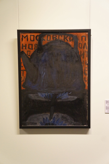 Mikhail Roginsky. Blue teapot. 1994
As follows from explication, the origins of Roginsky’s special attention to the shades of pink and gray are found at the very early stage of his work. Even during his work by profession - a theater artist - he first used these colors in the design of the "Balaganchik" Alexander Blok. This seems to be an unnecessary biographical detail, of course, secretly pays tribute to the whole discourse, formed around the artist’s works. So, it is widely customary to talk about a special “theater of the object”, which is driven in his paintings. As a literary illustration for him, researchers amazingly resort to quotes from Joseph Brodsky. Filigree strings of the poet’s words clinging to each other, perhaps, find their echo in the preparation of the ordinary painting of Roginsky, but if you look for a literary analogue, still really close to him, the writer Andrei Platonov, to whom the artist himself referred .
Something “unexpected”, which was supposed to be present in the work, makes his teapots, jugs, chairs, tables, boots, a jacket with caring portraits of a departed, but still painfully recognizable reality. Some of his well -known works can be seen at the current exhibition (“table, chair, light bulb” (1965), “kettle” (1965), “jacket” (1993), “as well as shoes” (1993)). The simplest element of the life world has its own character, the main feature of which is the joy of resistance to non -existence. Perhaps Roginsky is one of the few artists who managed to convey the living presence of these rough, rude household items, the process of observing which itself invisibly embodies the mythology of Soviet everyday life with its stopped time. “These paintings do not seduce, do not entertain, do not scare away. They are simply themselves ” [i] - in this brief resume from Nikita Alekseev, one can also recognize the appearance of the artist himself, whose place in the cartography of social relations of unofficial art is distinguishable almost exclusively through the influence of his works: he did not need a society of associates too much. He avoided flirting with the significance of his own figure necessary for purposeful figures of local art scenes, was not fond of metaphysics (except that a little in the 1970s, and rather from despair), was not busy fighting the regime or criticism of art. On the other hand, his “simplicity” radically distinguishes the lack of naivety, “art” in the eyes of Roginsky is a problematic term.
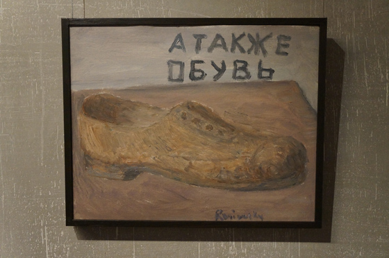 Mikhail Roginsky. As well as shoes ... 1993
Those few artists with whom it is customary to directly associate his name - Boris Turkish and Mikhail Chernyshev. Turkish, by the way, also has work about pink color - “bumper of the pink car” (1964). Apparently, due to the fact that all of them turned to the reproduction of distinguishable, simple and affordable objects and plots, there was a not completely disciplined tradition to call them agents of “Soviet pop art”. The problem, on the other hand, has not yet been resolved. They, as a rule, strive to overcome this formula, carefully peering into the plastic properties of Roginsky's works. So, indeed, some of his work with scenes from grocery (“showcase” (1982), “in the store” (1987)) unexpectedly call scenes with paintings by Mane, indeed, working with “bad” materials (for example, cardboard) leads to comparison with Arte Povera . In addition, many of his works find references to Dubuff, Duchan, Monet, Morandi, Gaston, Goye, Bruegel, even Pierrot della Francesca. As well as Bonnaru and Wuyar. And, of course, one cannot but recall the quiet paintings of Edward Hopper, whom Roginsky saw at the dawn of his creative biography and whose influence, of course, is undeniable. However, no matter how thin and observant these comparisons were, nothing gives us fully access to an alternative reading of his heritage, outside his local characteristics.
 Mikhail Roginsky. Showcase. 1982
Despite all the efforts of the researchers and connoisseurs of the work of Roginsky, it is difficult to get rid of this hasty, but catchy term, it is too convenient, how the implacable exotization of the Soviet background is too comfortable. And here I would like to again return to the already mentioned “doors” and “pink fence”. The next logical link in the chain of images of “border” objects that the artist addresses is, of course, “Metlakh tiles” (1964). However, this is his most famous work from this series, and at the exhibition you can find another variation of this motive - the pink “tile” (1964). We will not indulge in thoughts about what is behind these works - Rosalinka Krauss’s “grille”, “square” of Pete Mondrian, modernism, minimalism or other topos of contemporary art. Our task is another - to problemize the situation of Roginsky in the history of art again. At the same time, that the last (in fact four years later), the German artist Sigmar Polke in the Federal Republic of Germany does the work of Karl Andre in Delft, which is an image of a Dutch tile. The speculation here is, of course, not to compare the work of Roginsky and the Polish and to identify the differences between them, which, of course, exist, but to ask a question. Most of the German painting of the 1960s at the time of its occurrence was automatically subject to compared with American pop art. The Americans, for their part, also considered European painting a slightly flawed parody of their own. But for a number of reasons, in the process of not always the innocent movement of artistic life, this name had to be abandoned, and Sigmar Polke, like many other artists, gained an independent artistic name. For some reason, this does not happen with us, although the 1960s have long passed. If you continue to think with old categories, then in any case you need to talk about a completely different “trim” of the history of art. In our case, maybe it is still worth officially introducing, for example, the term “folk art”, and it will be much closer to the cash order of things (any negative connotation will be erroneous here). In this sense, as a blurry coincidence, the dialogue of the name of one still life “actually does not change” (1993) and Andrei Kuzkin’s work “just everything changes very quickly, and we cannot concentrate on anything” (2011). Who knows.
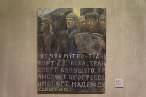 Mikhail Roginsky. Metro - transport of the future. 1996
Nevertheless, it is necessary to admit that, of course, Roginsky is considered a “radical innovator” (first of all, in connection with his works that interpret the tradition of Radi-Mide), and its influence on the development of social art and Moscow conceptualism (first of all, in connection with the sacralization of the object, the subject of everyday life) is considered undeniable. Almost a special tradition arose to compare his paintings with the works of Ilya Kabakov. The connection with the latter is captured, among other things, in the enthusiastic interspersed in the image of fragments of the text, which in both gives the presence of those who fill the common space of someone else's voices. The frequent quote to which they resort to decrypt by Roginsky’s works is his mention of how he, once noticing the railway poster, wanted to create something similar. It is interesting that before that, being in the army, he hid his profession, not experiencing a desire to engage in drawing posters and slogans. But, perhaps, the fact of turning to the poster is not interesting, but rather a motive for the movement with which the railway tracks are associated. Talking about how canvases with almost hiuratic images of matches and a gas stove appeared, he explained that it was very important for him to convey the movement. The first images of people appear on the metro train, at the exhibition in the premises of the fund you can also find such later later lilac paintings. But this motive is already taking this motive in its Opus Magnum , dedicated to Moscow, which he restores from memory from Paris (it is interesting how much this appeal is associated with the revision of the cult of historical memory of the 1980s-1990s). The capital - in its interpretation - is composed mainly of street scenes with the conditional figures of people, randomly advancing through the streets against the background of multi -storey buildings, with bursts in the mean interiors of food stores.
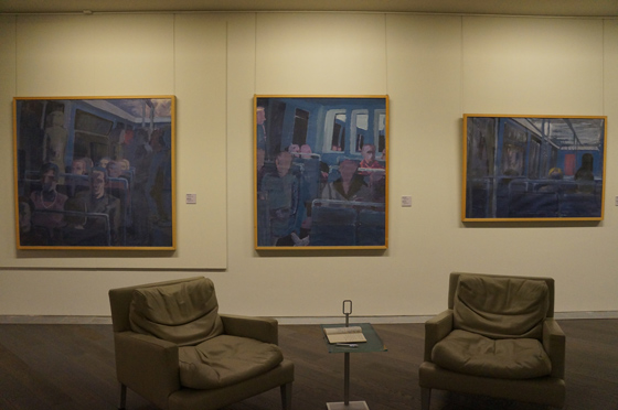 Mikhail Roginsky. Metro N 4. 1983. Metro N 1. 1983. Metro N 5. 1983
These paintings (maybe the best in his practice) leave a strange impression. On the one hand, Roginsky in the 1960s was in love with Moscow (“... in Moscow I liked literally everything: trams, cars, houses-everything that I considered a sign of civilization, modern life ...” [II] ). On the other hand, it is very tender, lovingly on his canvases, its wretched, sad unsightness is restored. Often these city landscapes look deliberately “childish”-this is how children who are not yet accustomed to complex geometric tricks of art art, but this seems to be again manifested by the artist’s gravity to the basic elements of the plastic language. His houses are often pink-with repeating windows, they again remind of the aesthetics of minimalist artists. By the way, an important and problematic moment for post -war painting is the relationship between the picture with the media: photography and cinema. This is a completely separate problem field, but it is interesting that many city scenes in Roginsky are arranged as a panel with storytellers. Deprived of sentimental lyrics and any pathos, the city here resembles not so much the Soviet cinema of the 1960s as in general the 1960s cinema, if it were shot on VHS in the 1990s with its accessibility, uncomplicated effects and with a nostalgic way today.
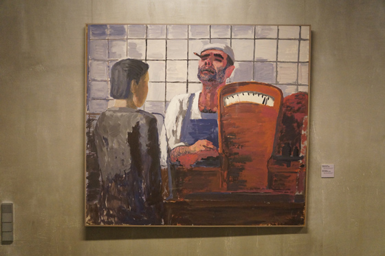 Mikhail Roginsky. Meat department. 1981/1982
 “I write what I know,” Roginsky often repeats in an interview. In the texts of the artist, one can often meet the mention that his paintings are embodied by a general memory, a collective dream about Moscow [III] , that he still managed to create something, at least somehow reconciled with her. Although Roginsky, according to universal statements, recreates the Moscow myth, now and then you can catch yourself thinking that it is still a conditional city-maybe Novgorod, maybe Ryazan or, for example, Perm. And everywhere this is a quiet resistance - it seems, the very material of life, that is, in general, to everything. Although it is clear that before us the Soviet city (Roginsky in the early 2000s was surprised at how much the city changed)-being on the outskirts, we easily find the same houses, crossings, crossings, almost the same very conditional people. The artist himself said that, falling into a circle of people, even if the associates, he “immediately begins to look at the door” [IV] . And, unfortunately, most likely, he will have to remain one of those loners-artists whose name is listed in the forerunner. If today we got used to the idea that the world is infinitely complicated and confused, then Roginsky’s work remind of the need to see its simplicity. He wanted to be today's artist, he was and, I want to notice, they have left.
[I] Nikita Alekseev. Do not seduce, do not scare, do not say // Mikhail Roginsky. Pedestrian zone. Painting 1962-1967, 1995-2002. - M.: GTG, 2003. S. 127-128
[II] Andreeva E.Yu. The angle of inconsistency. School of non -conformism. Moscow - Leningrad 1946-1991. - M., Art of the XXI century, 2012
[III] Leonid Belyaev. Epic everyday life, or see Moscow without intermediaries // Mikhail Roginsky / Almanac. Ext. 192. - St. Petersburg: Palace Editions , 2008. S. 24-31
[IV] Galina Elshevskaya. Moscow genres. // Mikhail Roginsky / Almanac. Ext. 192. - St. Petersburg: Palace Editions , 2008. S. 18-22
The heading "prints" is supported by the Fund for Assistance to the Study of Russian Fine Arts "Russian Art The World".