
Translated material
Multicode
Already in June next year, all entrepreneurs of Pskov, and then Great Luke, will have to put the signs in order
In Pskov, a problem with the so-called design code arose out of the blue: officials decided to oblige the entire business to accept general rules on signs. The idea itself seemed good, and the changes became obviously positive, but, as always, the mechanism and “skill” of the executive authorities pumped up.
The idea to introduce a local design code arose in the beginning of 2019, the project was developed as part of a change in the rules for the improvement of Pskov. The design code in a general way is an instruction on the placement of signs and advertising structures in the urban space, which forms a comfortable urban environment and saves the streets of the “visual noise”.
The owners of signs who do not fulfill the conditions of the design code are brought to administrative responsibility. For the first violation, you can give up to 50 thousand rubles, for the repeated - up to 100 thousand rubles. Included with a fine is a warning about the need to replace the sign within 15 business days: if the owner ignores it, then the structure that does not correspond to the design of the city budget is dismantled, and the violator will be issued for work.
A document of the rules for placing signs in Pskov occupies almost 80 pages, but it does not have many specific formulations: this is rather an illustration - as possible and as possible. For example, you can not use signs with a substrate or glue windows by more than 30 percent. The height of the letters in the historical part should be no more than 50 centimeters, in the rest of the city - up to 70 centimeters, a sign that is located on the roof of the building seems to be not under the standards and so on. In general, such an amount of information can turn his head.
As a result, on the best Russian tradition, a commission appeared to approve the signs. Plus, the information campaign in Pskov for compulsory “design-code” was actually failed, by June many entrepreneurs did not take the innovations seriously. And then the dismantling of signs from the authorities rushed, which - like design development and installation itself - began to be carried out at the expense of business.
As a result, June and July turned to entrepreneurs in the historical part of the city and unnecessary (moreover-noticeable) expenses, as well as bursts in the commission to “approve design codes”.
There was another problem when dismantling: the deputy head of the city administration Pavel Volkov said that when removing old signs, ugly facades often open. Someone should also put them in order, but a simple solution to this problem here still cannot be found.
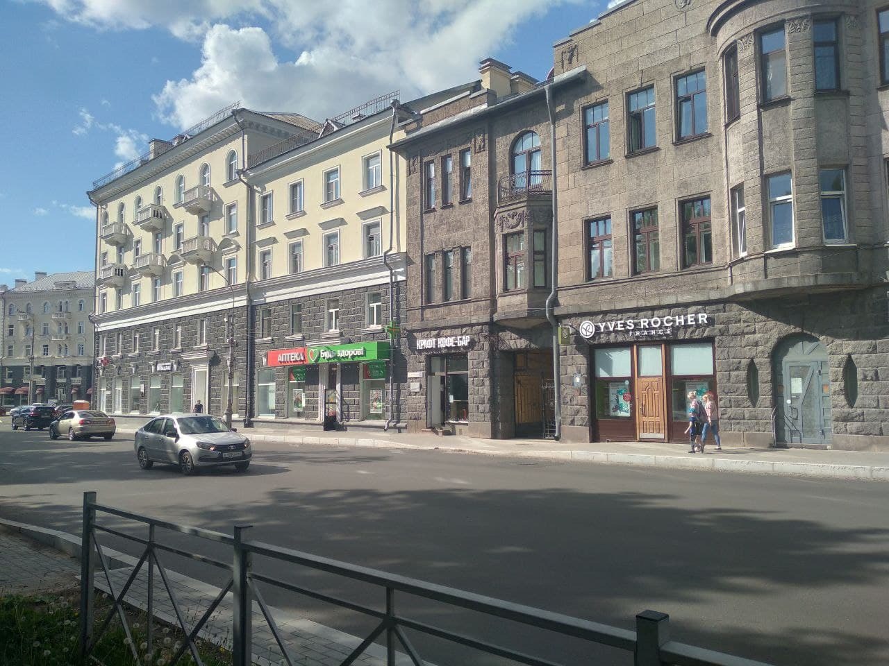
Buildings on Oktyabrsky Prospekt with new standards for signs. Photo: Pg
The very idea, however, approve of the idea: the question of revising the design of the city space has been suggested for a long time, said Dmitry Permyakov, deputy of the Pskov City Duma from Yabloko.
“Somehow it was necessary to regulate outdoor advertising in Pskov for a long time: against the background of neighbors, it seems, as a tourist Pskov, with collective farm alphabal advertising banners looked frankly losing. Therefore, a single design code was necessary. Initially, recalling the wretched reconstruction of the embankment, Lenin Square, the building of the “tablet” and the October cinema, I was skeptical, but we must pay tribute to the developers: they spied a lot from Moscow, St. Petersburg, European cities and created a whole, well-read document with an abundance of illustrations and examples of the design of the design code, the code says, the code says Permyakov.
The design code came to the Pskovichi, like winter every year-extremely unexpectedly. The landscaping project was approved in May 2020, the entrepreneurs had a whole year to bring their signs in accordance with the new rules - from June 3, 2021, the design code began to be used in the historical part of Pskov, and next year it will spread throughout the city.
Not all business owners were ready for such a rapid development of events, back in July, in an interview with PG, the business ombudsman of the Pskov region Arkady Muryl *ё *in “Nobody as a whole complains that it is unplanned expenses. They complain that a year passed, and everyone was not up to this - and then suddenly a control department arose, which writes to everyone the instructions to remove, change, dismantle. There are many complaints that signs have been agreed for a very long time: they were forced to remove, but they have not yet been issued approvals. The business works without signs, ”he notes.
The issue of coordination of signs with the commission announces many: the co-founder of the Misha cafe Alexander Alekseev complains that there is no clear instructions for placing the sign in the design code, so the commission members interpret controversial moments in their own way: “The main problem we encountered when approving the sign that people are accepted by: this is not an automatic system in which you load the initial Parameters. If a person in the commission does not like centering, then you are forced to redo, although this does not affect the general view of the facade of the building. It is impossible to prescribe everything in the design code, so there is a certain scatter, ”he states. The Misha did not have problems with the sign on October: the cafe was opened when it was already known about the entry of new ones, and the sign was made taking into account new standards.
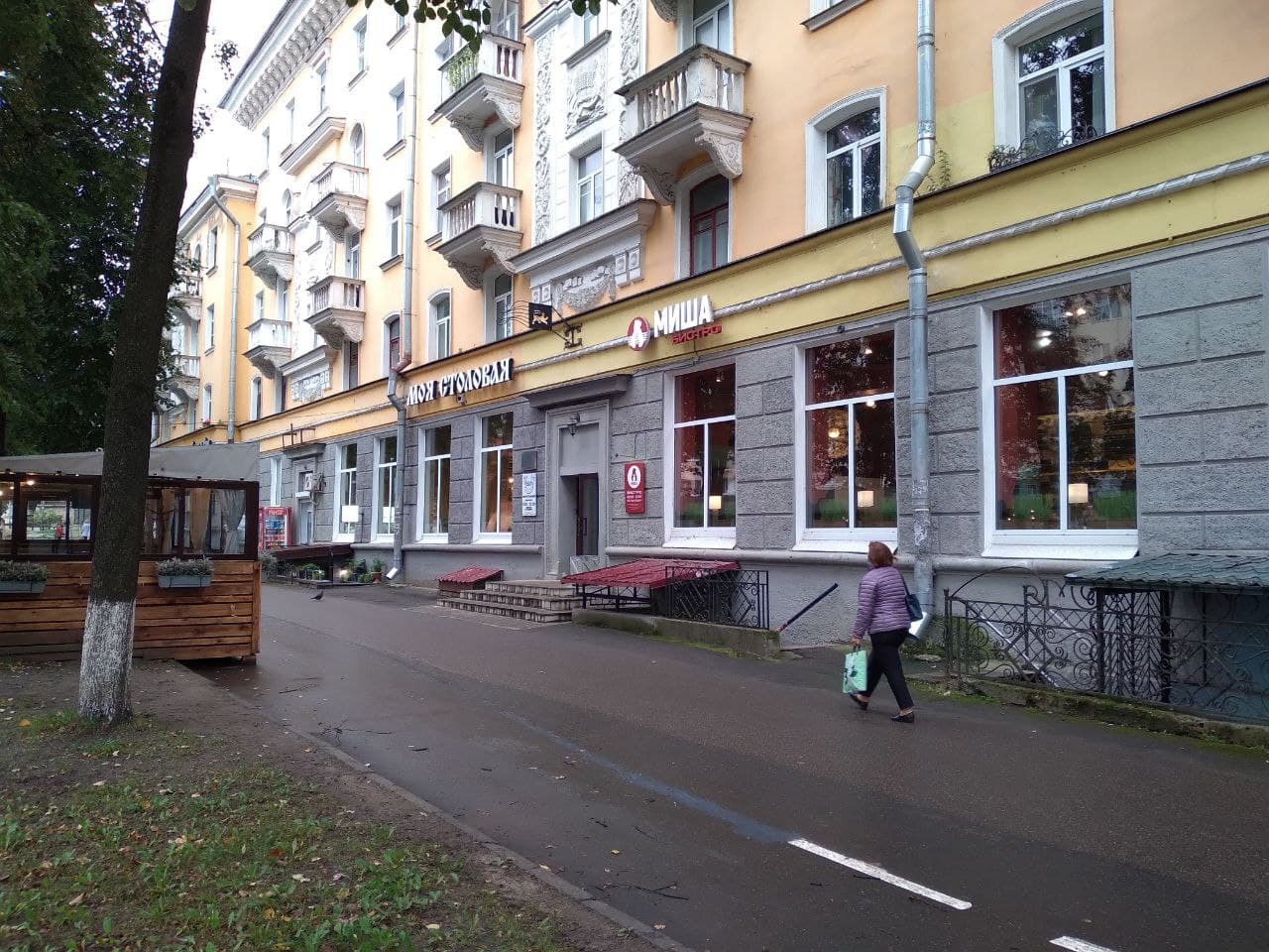
The sign of the cafe "Misha" on Oktyabrsky Prospekt. Photo: Pg
“Each member of the commission has his own vision,” Murylev agrees with him. - “Here, it seems to me, the color will be resonated, but there is no”, “Here the red will be very bright, and there it will be very good on the gray”, “Here we can place the sign on the visor, because the visor is provided for the design features of the building, and there we can’t on the visor, because this non -residential room in the apartment building and people made themselves. A lot of subjective approaches. "
The approval machine quite often marries design projects, which causes serious indignation in the entrepreneurial community.
“The controversial moments are that according to the design code, the letters should be white or black, and the owners in the designed design of the logo or signs are pink, and they are forced to make letters white, in my opinion, it is bustling,” the co -owner of Misha complains.
“The question arises both with us and entrepreneurs: why is it proposed to use only the so -called monochrome colors there? - The owner of the Telecom advertising company Yuri Amosov is lamented. - I agree that they can be used on some historical buildings so that the signs are not knocked out, but on the other hand, there are many new buildings in the historical part, where colored signs would not hurt. Of course, there is some kind of slack on the part of the commission, which sometimes allows entrepreneurs to use other colors. But still, this is not spelled out in regulatory acts, but comes from the private perception of members of the commission.
Arkady Murylev also recalled that after holding a public hearing, in fact, all proposals from business owners were canceled. “People for one and a half to two months I can’t get approval. Production takes at least two more weeks, because not all advertising agencies are even taken to do this. Many entrepreneurs for 2-3 months cannot get approval. Plus the cost of a sketch project, manufacturing a sign - of course, this is a lot of costs for many enterprises, ”he believes.
According to the business ombudsman, along with the increased demand for the manufacture of new signs, the prices of them have taken off, and the number of advertising agencies that take up such work has decreased. “A large stir for the manufacture of signs in accordance with the design code has begun. And now many advertising agencies do not even undertake to do, because they do not know whether this sign will correspond to the code or will not, ”says the Commissioner for the Protection of the Rights of Entrepreneurs.
True, the advertiser Yuri Amosov does not agree with this assessment at all: “Raising the prices for signs due to increased demand is speculation. In the competitive situation that exists in Pskov, if the advertisers wanted to raise the price tag, they could not: all the same, the business will find the one who will do it at a normal price. Now, in principle, everything is getting more expensive everywhere: forest, metal, plastic, and, accordingly, signs - the increase in prices is primarily associated with this. The average price for the city for a light volumetric letter is 80-100 rubles for a linear centimeter. The letter, for example, 50 centimeters high costs 4.5-5.5 thousand rubles, ”Amosov said
Another weak point of the design code is the coordination of signs at objects of cultural significance: a separate design regulation has been developed for them, and it is contrary to the city design code. How to make these two documents do not contradict each other - a special task for officials.
“The old regulations are operating in relation to the monuments, according to which signs were previously issued, and now they, it turns out, do not fall under the design code, they had to be removed by order of the control department. The Monument Protection Committee is now trying to establish a new regulation, which again does not coincide with the Pskov design code, ”Murylev shrugs his hands.
Local residents are also concerned about the fate of historical buildings: Pskovichka Julia Nikiforova is sure that some buildings did not assume any signs at all.
“From the point of view of architecture, it is necessary to divide all buildings into two positions. Large buildings - for example, Oktyabrsky, 22 (the house in which the book "Book" is located - ed.) Or the house of Potashev (Oktyabrsky, 32), that is, buildings of the late XIX - early XX centuries, which implied a business format and there were originally placed signs. And there are part of historical buildings that do not imply any signs at all, for example, the apartment building of the insurance agent Bernard Kerber (Oktyabrsky, 30a): there the signs look like a blot on a dress. It seems to me that each building needs to be approached individually, ”Nikiforova believes.
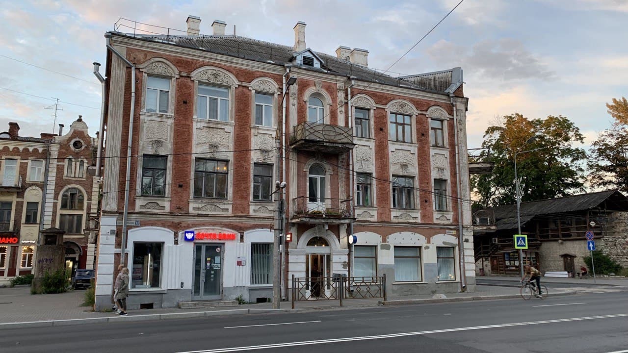
Kerber at home (left) and Potasheva (right), photo: Maxim Bartulev / PG
The chairman of the Pskov branch of the All -Russian Society for the Protection of History and Culture Monuments Irina Golubev agrees with her: “Now the functions of historical buildings have changed in many ways, for example, the first floors of some buildings have become trade. And, of course, signs are needed, which indicate what function is now at the building. The sign is advertising. But the question is how this is actually embodied. So far, we are all only at the beginning of this path, ”she said.
But some representatives of the entrepreneurial community are absolutely sure: the time of introduction of the new rules for the improvement of the city was chosen unsuccessfully. Business owners have not yet had time to recover from financial losses that they underwent due to pandemia, and they are again forced to fork out. “It seems to me that this idea is not the most suitable time and not the most reasonable time,” the director of Imperial, Nikolai Rassadin , commented by the idea of design codes. - It was a very difficult year, entrepreneurs have not yet crawled out of the pit in which they got. For the year and a half that there is a pandemic, many trading enterprises suffered losses and to make a sign in the vein in which the city administration offers, it is necessary to bear certain costs. ”
According to Rassadin himself, the legendary sign of the “imperial” itself should not disappear, because it refers to the so -called abadial constructions.
The historical zone of the city is planned to be brought into line with the design code until September 2021, but the realities dictate their conditions, and it is unlikely to be possible. But the head of the Pskov region, Mikhail Vedernikov, is strongly determined to spread similar regulations in all municipalities of the region. In the Great Luki, public hearings on the topic of the design code have already been appointed. Pskov, on the other hand, will have to “change” entirely until June 1, 2022, so - follow the signs.